© 2026 usetools. All rights reserved.
Organizing elements so users naturally notice or read them in order of importance (e.g., larger headers, bolded text).
Visual hierarchy in UX/UI and design refers to the strategic organization of elements within a user interface to guide users' attention and interaction. It leverages visual cues like size, color, typography, and spacing to create a structured order of importance, ensuring that users focus on the most critical elements first.
Visual hierarchy is crucial for enhancing user experience by directing users' focus toward key content, such as calls to action or navigation menus. This guidance simplifies decision-making and improves readability, especially in digital environments where users quickly scan content.
Visual hierarchy is essential in homepage design, navigation menus, and responsive design. It helps users quickly grasp the structure and significance of content, facilitating navigation and task completion. In responsive design, prioritizing elements ensures that critical information remains accessible across different screen sizes.
While visual hierarchy primarily influences user interaction, well-organized content also supports SEO by making it easier for search engines to understand the structure and relevance of a webpage. Clear headings and organized content can enhance crawlability and improve user engagement metrics, which are important for SEO.
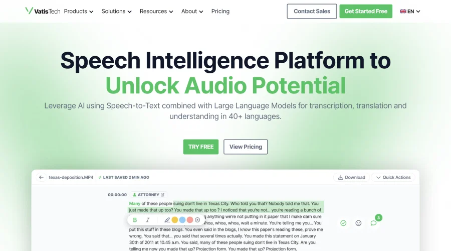
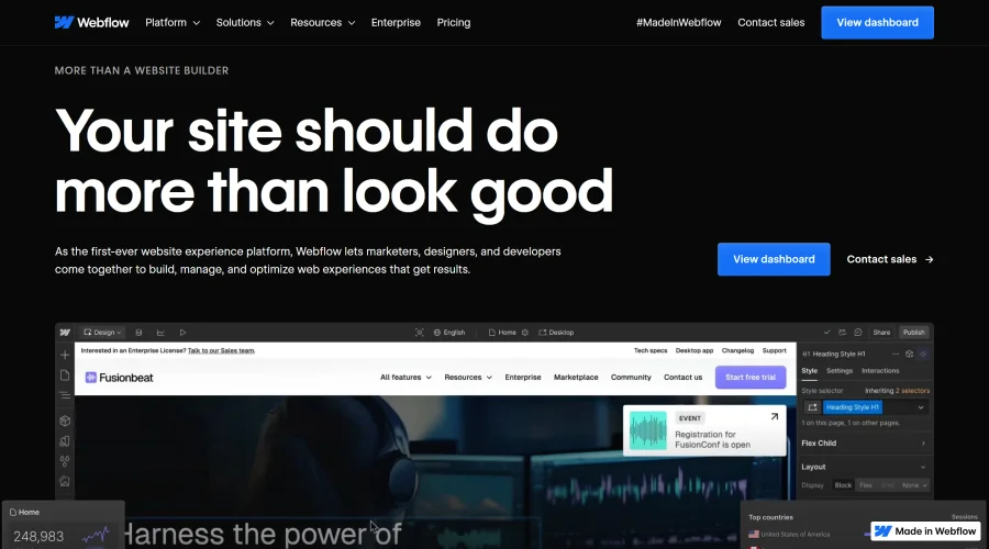
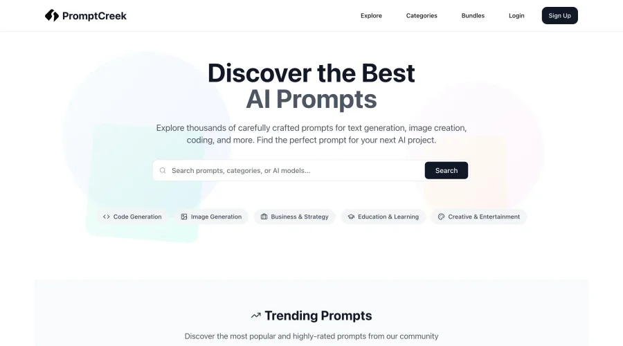
Many successful websites and applications demonstrate effective visual hierarchy by using size, color, and typography to direct user attention. For instance, prominent headlines and clear navigation menus are common examples of visual hierarchy in action.
Visual hierarchy is a fundamental principle in UX/UI design that enhances user interaction by organizing content in a clear, logical manner. By leveraging visual cues, designers can create interfaces that are both aesthetically pleasing and highly functional, ultimately improving user engagement and satisfaction.
Discover tools that help you apply visual hierarchy in your work.

The design glossary is just the beginning. Explore more terms, discover tools, and level up your design skills.
Designing products and interfaces usable by people with varying abilities (e.g., vision, motor, cognitive).
Prompt Creek is a free community-driven repository featuring thousands of AI prompts. Discover, bookmark, and share quality prompts for ChatGPT, Claude, and other AI tools.