© 2026 usetools. All rights reserved.

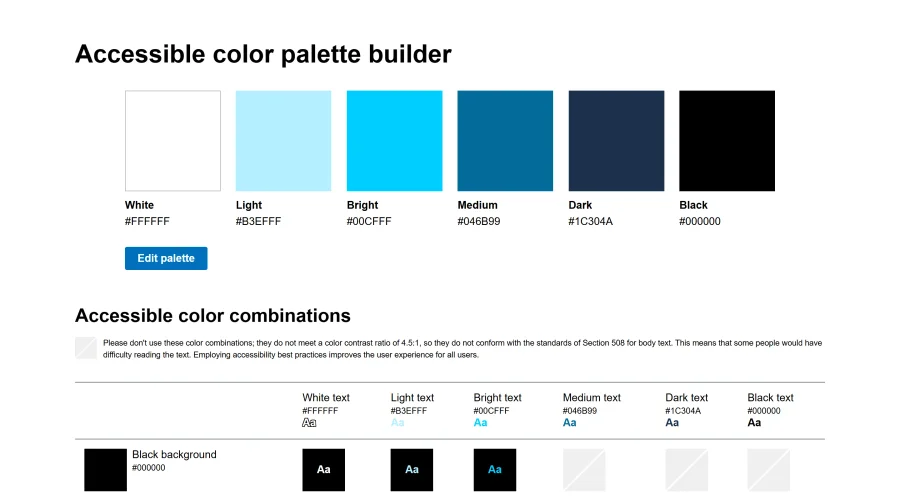
A tool assessing ADA compliance of color contrasts.
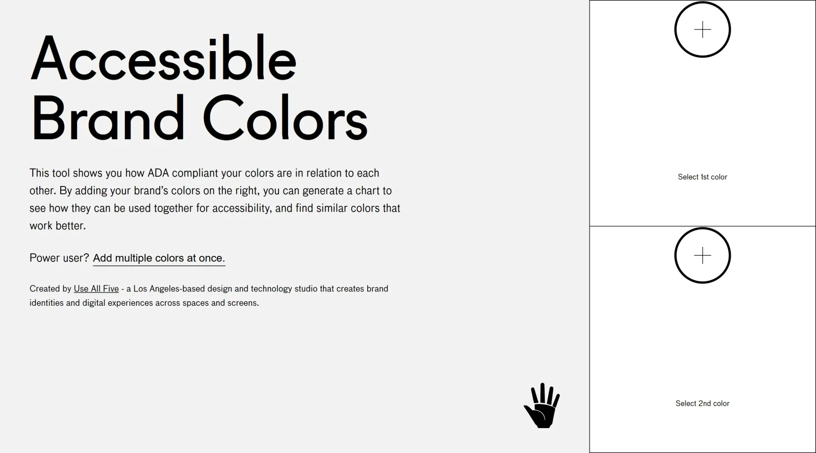
Accessible Brand Colors is a free design tool in the Design category that evaluates color combinations for accessibility compliance. It generates a chart displaying contrast ratios between user-input brand colors, helping designers identify pairs that meet Web Content Accessibility Guidelines (WCAG) standards for text, UI elements, and readability. This tool fits into the early stages of the design workflow, such as brand guide development or color palette creation, where ensuring sufficient contrast prevents issues like low visibility for users with visual impairments.
Accessible Brand Colors serves UI/UX designers, brand strategists, and front-end developers working on web and digital products requiring WCAG-compliant color schemes. It suits projects involving brand identity creation, design system builds, or accessibility audits, particularly for teams targeting Level AA conformance. Experience levels range from junior designers learning contrast rules to senior professionals streamlining palette validation. Small agencies and solo freelancers benefit from its simplicity in workflows without complex software. Visit Accessible Brand Colors
Discover more design resources
Explore our comprehensive design glossary to master essential terminology from A/B Testing to Wireframes.
Browse GlossarySearch through our entire collection of design tools and resources
Mode turns your product’s codebase into editable canvas frames. Refine real UI with visual controls, experiment with AI then share or hand off for review.
Prompt Creek is a free community-driven repository featuring thousands of AI prompts. Discover, bookmark, and share quality prompts for ChatGPT, Claude, and other AI tools.
Vatis Tech is the most powerful speech-to-text infrastructure. It can be used to transcribe user interviews and client meetings.
Accelerate website creation without needing to code.
47 tools