

A design tool for creating color palettes that meet accessibility standards.
What it costs
- Free tier
- No
Page rendered only a 'Loading…' placeholder, so no pricing could be confirmed; it appears to be a free open-source (GitHub-hosted) tool but that is unverified from the scrape.
Auto-checked on 8 August 2026Source
About Accessible Color Matrix
What Is Accessible Color Matrix?
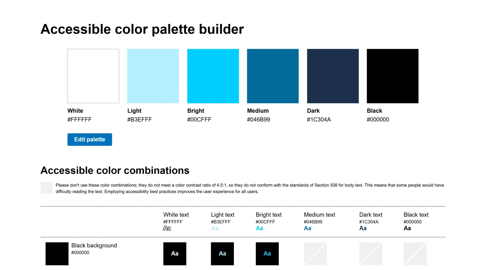
Accessible Color Matrix is a free design tool in the Design category that assists designers in building color palettes with combinations meeting accessibility standards. It generates a matrix to evaluate contrast between multiple colors, helping ensure compliance with guidelines such as WCAG levels AA and AAA for text and non-text content. This tool fits into the early stages of the design workflow, particularly when establishing design tokens like surface, text, and interaction colors before applying them to UI elements or visual content.
What Accessible Color Matrix Does
- Accepts up to six colors as input to create a visual matrix of combinations.
- Checks contrast ratios between foreground and background colors against WCAG standards.
- Indicates compliance levels such as G for non-text, AA for text, and AAA for enhanced text contrast.
- Provides an overview of which color pairs pass or fail accessibility requirements.
- Supports fine-tuning of base colors for palettes used in design systems.
- Displays results in a grid format for quick visual assessment of palette viability.
How Accessible Color Matrix Can Be Used
- Designers input brand colors to verify which combinations achieve sufficient contrast for UI components like buttons and text overlays.
- Developers test color ramps and semantic tokens by pasting hex values to identify passing pairs for light and dark modes.
- Teams create accessible PowerPoint templates or infographics by checking brand palette interactions against accessibility thresholds.
- During palette refinement, users adjust colors iteratively to meet AA or AAA levels without altering overall hues significantly.
- For virtual learning environments or illustrations, the matrix confirms recolored elements align with brand while maintaining readability.
Who Is Accessible Color Matrix For?
Accessible Color Matrix serves designers and developers working on accessible design systems, UI kits, or brand palettes where color contrast compliance is required. It suits roles like UI/UX designers, front-end developers, and accessibility specialists handling projects such as websites, apps, or visual content needing WCAG adherence. Experience levels range from intermediate users familiar with color theory to teams auditing existing palettes for low-vision accessibility. Visit Accessible Color Matrix
Featured Tools
Sponsored
Artlist
Royalty-free music, SFX, 8K footage, templates, LUTs and 100+ AI models on a single subscription for video creators.

Icons8
Large icon packs featuring over 10,000 icons for consistent design themes.

Vidu
AI video generator with text, image and reference-to-video modes, producing 3–16 second clips at up to 1080p with characters that stay consistent across shots.
Your tool here
The tools above are our own picks until the slots sell.

More Accesibility Tools
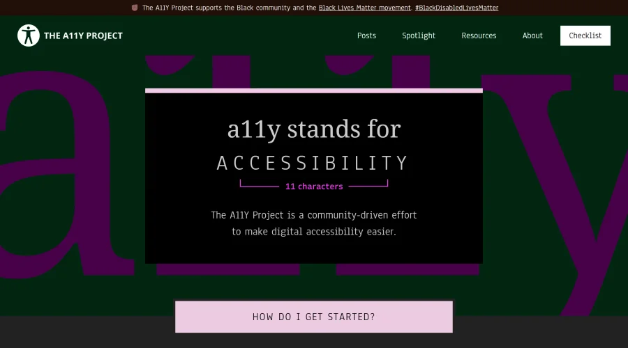

A11Y Project
A community-led initiative to simplify digital accessibility.
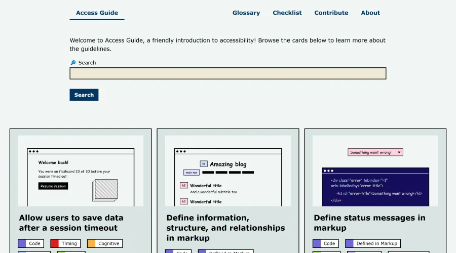

Access Guide
An easy-to-understand introduction to digital accessibility.
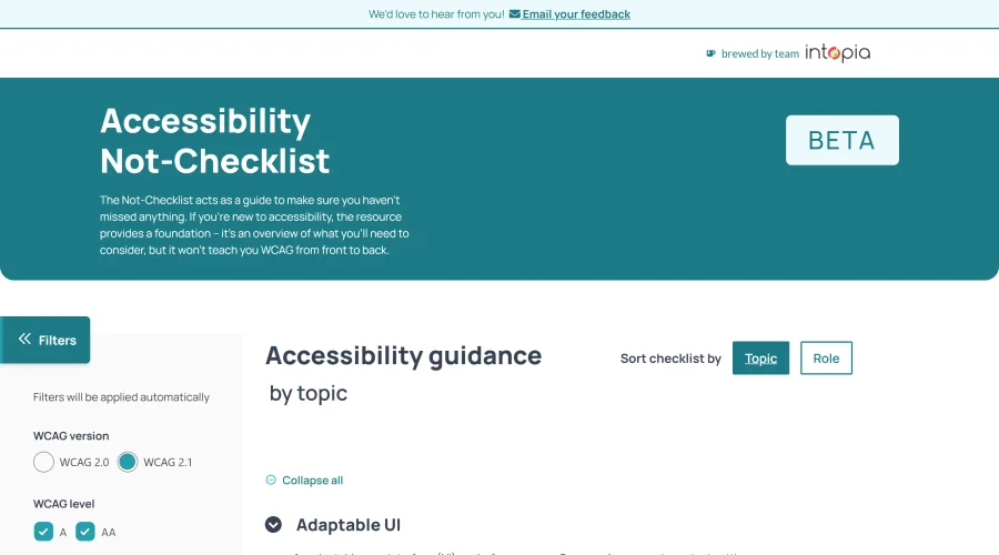

Accessibility Not-Checklist
Comprehensive guide to ensure accessibility in design projects.
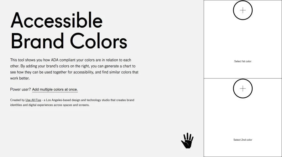

Accessible Brand Colors
A tool assessing ADA compliance of color contrasts.
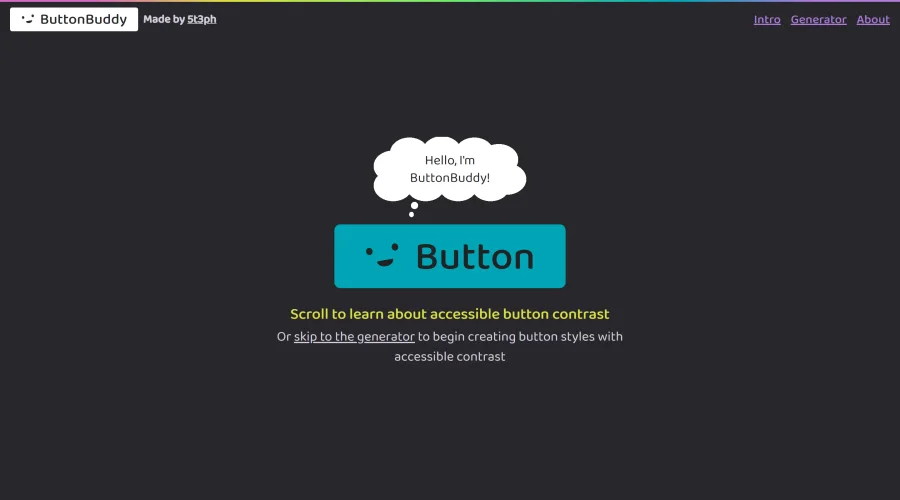

Button Buddy
Solutions for ensuring accessible contrast in button designs.
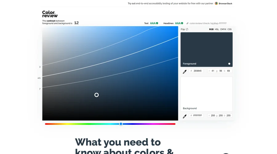

Color Review
A platform for discovering and choosing accessible colors.
Explore Other Categories
Discover more design resources
New to Design?
Explore our comprehensive design glossary to master essential terminology from A/B Testing to Wireframes.
Browse GlossaryLooking for something specific?
Search through our entire collection of design tools and resources