
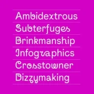
Instagram’s new global typeface blending future and past.
What it costs
- Free tier
- Yes
Instagram's proprietary brand typeface; scraped page is the generic Instagram about-homepage with no font-specific or pricing info.
Auto-checked on 8 August 2026Source
About Instagram Sans
What Is Instagram Sans?
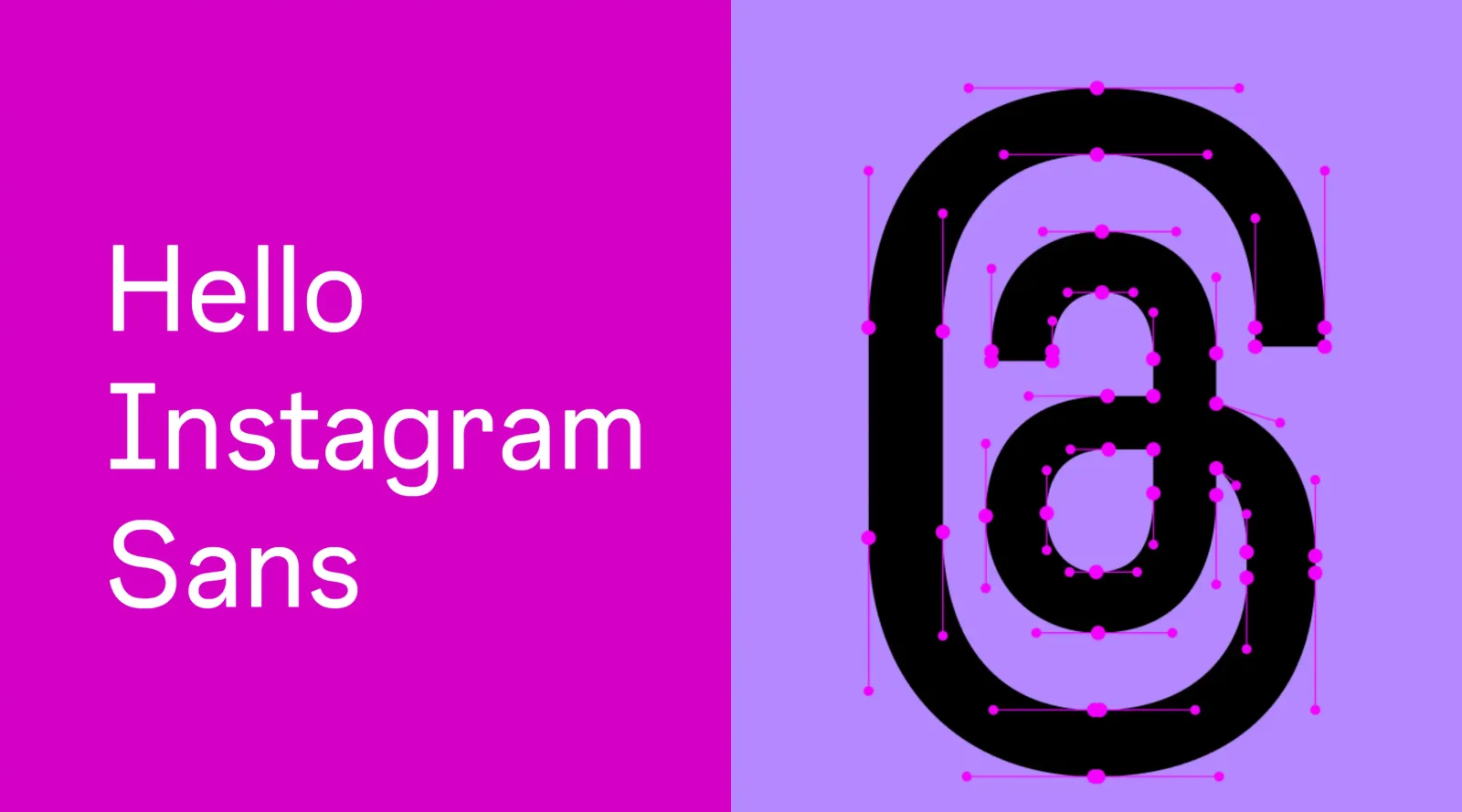
Instagram Sans is a custom typeface developed by Instagram as its global brand font in the typography category. Designed by Colophon Foundry, it blends the timeless qualities of grotesque sans-serif typefaces with contemporary elements, drawing inspiration from Instagram's logo and visual history. Instagram Sans serves as a core component in branding, appearing in logos, marketing materials, advertisements, and interface elements across platforms. It fits into design workflows for creating consistent visual identities, particularly in digital and print applications where brand cohesion is essential. Available at no cost for external use in certain contexts, Instagram Sans supports multiple weights and styles without a specified pricing model for general access.
What Instagram Sans Does
- Provides proportional weights in Light, Regular, Medium, and Bold for versatile brand applications and everyday use.
- Offers Condensed counterparts in matching weights, optimized for 16:9 aspect ratios like Instagram Stories and mobile screens.
- Includes unique Headline variants for each letter and numeral, enabling gestural and cursive-like typographic effects as visual punctuation.
- Supports global scripts such as Arabic, Thai, and Japanese through partnerships with language experts, ensuring multilingual accessibility.
- Employs geometric shapes from the Instagram glyph—square, circle, and dot—as foundational elements for a nuanced, organic character set.
- Delivers scalable forms suitable for headlines, body text, and small interface labels across various surfaces.
How Instagram Sans Can Be Used
- Applied in marketing campaigns, websites, and billboards to maintain a unified brand identity with its distinct grotesque-inspired forms.
- Integrated into app interfaces, logos, and ads for consistent typography that aligns with Instagram's visual heritage.
- Utilized in Stories and Reels for expressive text overlays, leveraging Headline styles for rhythmic, hand-drawn-like intonation in user-generated content.
- Employed by designers in digital layouts requiring condensed variants for portrait and landscape formats, such as social media graphics matching 4:5 or 16:9 ratios.
- Incorporated into multilingual projects where support for non-Latin scripts ensures legibility and inclusivity across global audiences.
Who Is Instagram Sans For?
Instagram Sans targets graphic designers, brand strategists, and UI/UX developers working on social media branding or digital content creation. It suits projects needing a versatile sans-serif typeface with grotesque roots, multiple weights, and global script support, particularly for teams handling Instagram-related visuals or similar platform identities. Experience levels range from junior designers experimenting with headline effects to senior typographers refining condensed layouts for mobile-first applications. Developers integrating custom fonts into apps or websites also benefit from its scalability and aspect ratio compatibility. Visit Instagram Sans
Featured Tools
Sponsored
Artlist
Royalty-free music, SFX, 8K footage, templates, LUTs and 100+ AI models on a single subscription for video creators.

Icons8
Large icon packs featuring over 10,000 icons for consistent design themes.

Vidu
AI video generator with text, image and reference-to-video modes, producing 3–16 second clips at up to 1080p with characters that stay consistent across shots.
Your tool here
The tools above are our own picks until the slots sell.
Spotlight
SponsoredRotates daily
Animated Icons 2.0
Enhance your projects with 900+ animated icons.
Tools we recommend
Editorially chosen. Some links above are affiliate links — if you sign up we may earn a commission, at no extra cost to you.
More Typography Tools


ZnortDesigns
Explore your local font library, discover font pairings, and find curated typography resources and design deals in one designer-friendly tool.

FontsBy
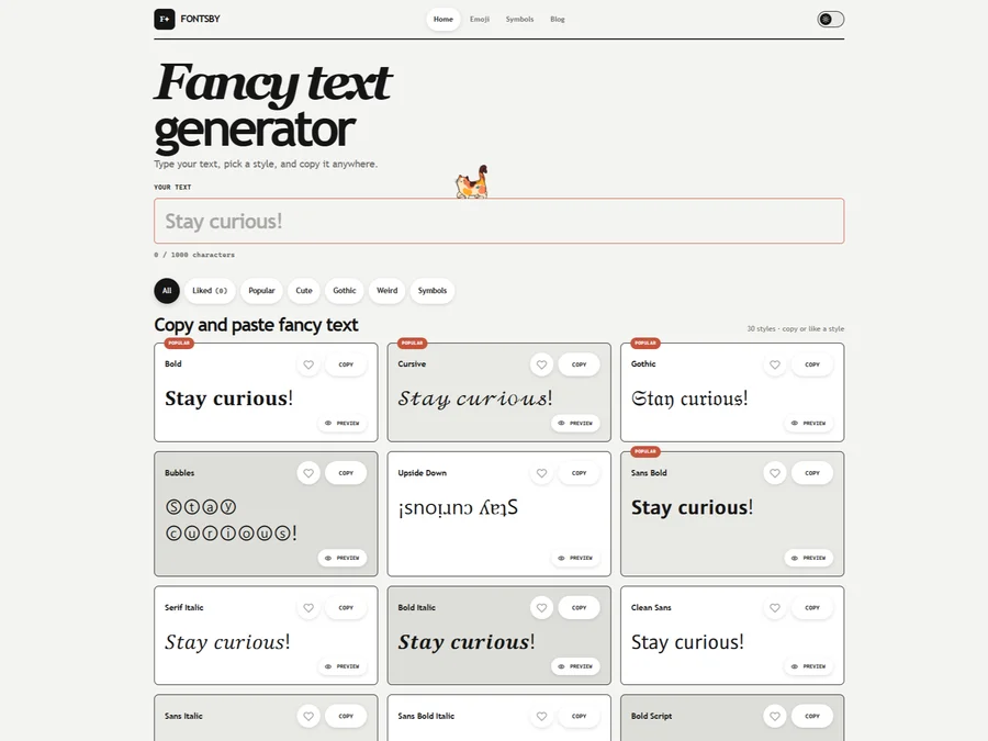
Fancy text generator for Instagram, Twitter, TikTok and Discord. Copy and paste bold, cursive and stylish Unicode fonts, symbols and emoji instantly for bios, usernames, names and social media posts.


205TF
French type foundry showcasing work from independent designers.


All Free Fonts
A selection of beautiful, free fonts curated for quality.


atipo
Digital foundry and design studio specializing in typefaces.


Beautiful Web Type
Guide to the best open-source typefaces.
Explore Other Categories
Discover more design resources
New to Design?
Explore our comprehensive design glossary to master essential terminology from A/B Testing to Wireframes.
Browse GlossaryLooking for something specific?
Search through our entire collection of design tools and resources