© 2026 usetools. All rights reserved.
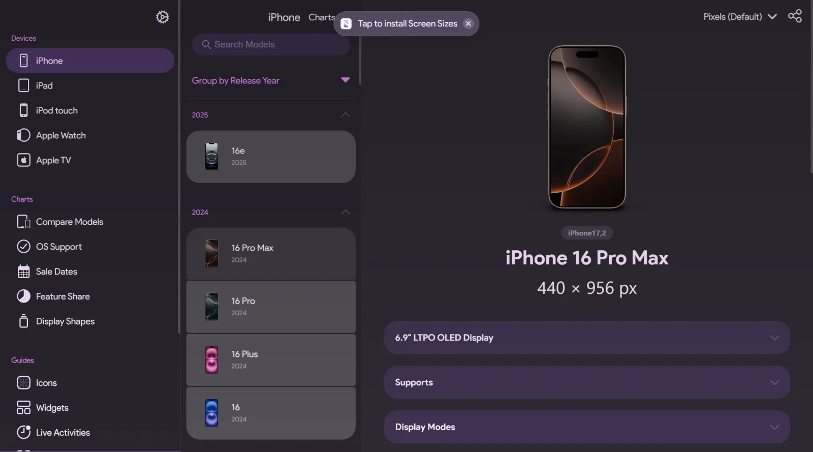
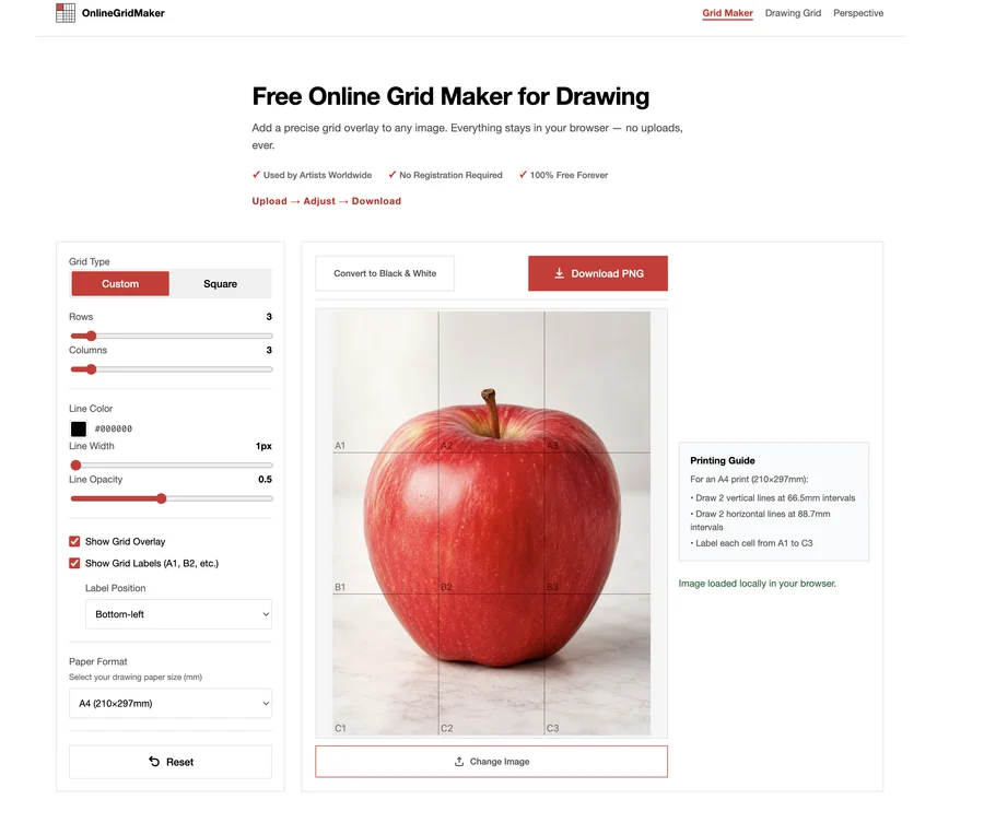
Screen Sizes is a free design tool in the design-tools category that serves as a comprehensive guide to Apple display sizes. It provides detailed specifications for screens across iPhone, iPad, MacBook, and other Apple devices, including physical dimensions, resolutions, and logical resolutions. Designers and developers use Screen Sizes during the planning stages of responsive design workflows to ensure layouts adapt correctly to various Apple device screens.
Screen Sizes suits UI/UX designers, front-end developers, and product teams working on Apple platforms who need accurate display data for responsive layouts and asset creation. It supports junior designers learning device breakpoints as well as experienced teams handling cross-device compatibility in iOS and macOS projects. Beginners in Apple development find its organized tables useful for quick lookups, while agencies managing multi-device portfolios rely on it for specification verification.Visit Screen Sizes
Discover more design resources
Explore our comprehensive design glossary to master essential terminology from A/B Testing to Wireframes.
Browse GlossarySearch through our entire collection of design tools and resources
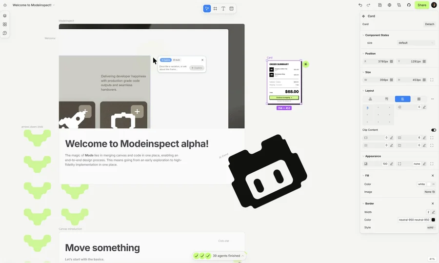
Mode turns your product’s codebase into editable canvas frames. Refine real UI with visual controls, experiment with AI then share or hand off for review.
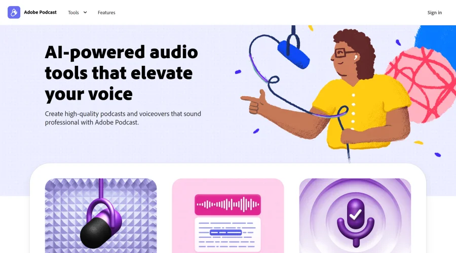
Prompt Creek is a free community-driven repository featuring thousands of AI prompts. Discover, bookmark, and share quality prompts for ChatGPT, Claude, and other AI tools.
Vatis Tech is the most powerful speech-to-text infrastructure. It can be used to transcribe user interviews and client meetings.
Accelerate website creation without needing to code.

Mode turns your product’s codebase into editable canvas frames. Refine real UI with visual controls, experiment with AI then share or hand off for review.
19 tools
