© 2026 usetools. All rights reserved.

Create a Figma library directly from Storybook for seamless integration.
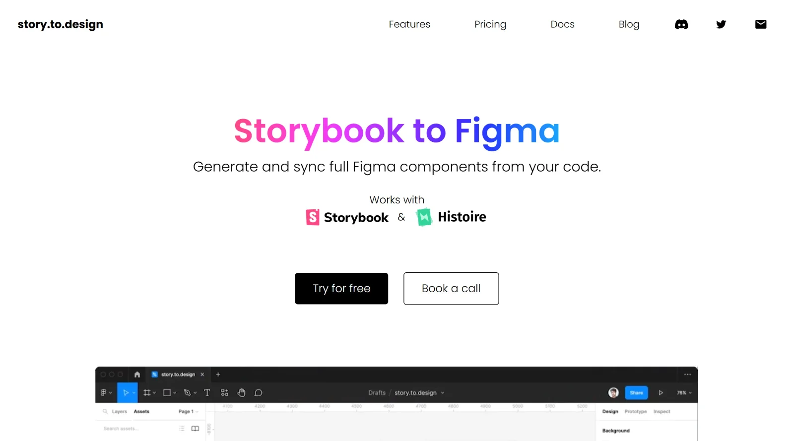
story.to.design is a Figma plugin in the design-toolscategory that imports components from Storybook to create a Figma library. It enables teams to generate and maintain UI kits or libraries directly from Storybook, Backlight, or Histoire stories, supporting a paid pricing model.
The core purpose of story.to.design is to transform coded components into Figma-ready assets, bridging design and development workflows. It fits into design systems where consistency between code and design is essential, allowing updates from Storybook changes to sync automatically in Figma.
Designers encounter scenarios where Storybook components evolve in code, but Figma files lag behind; story.to.design addresses this by enabling quick imports and one-click updates in real project iterations.
story.to.design serves design and development teams maintaining design systems with Storybook, particularly UI/UX designers and front-end developers who need code-accurate Figma libraries. It suits projects using Figma for prototyping and Storybook for component documentation, from mid-sized teams to larger organizations handling frequent updates across frameworks like React or Vue. Experience levels range from intermediate users familiar with plugins to advanced practitioners scaling UI kits.
Discover more design resources
Explore our comprehensive design glossary to master essential terminology from A/B Testing to Wireframes.
Browse GlossarySearch through our entire collection of design tools and resources
Prompt Creek is a free community-driven repository featuring thousands of AI prompts. Discover, bookmark, and share quality prompts for ChatGPT, Claude, and other AI tools.
Vatis Tech is the most powerful speech-to-text infrastructure. It can be used to transcribe user interviews and client meetings.
Accelerate website creation without needing to code.
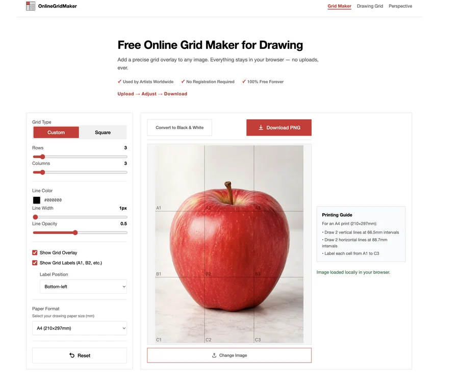
Free online grid maker for artists and drawing learners. Add customizable grid overlays to reference images directly in your browser.
19 tools