

What it costs
- Free tier
- Yes
Open-source and free frontend workshop; commercial testing (Chromatic) is a separate product.
Auto-checked on 8 August 2026Source
About Storybook
What Is Storybook?
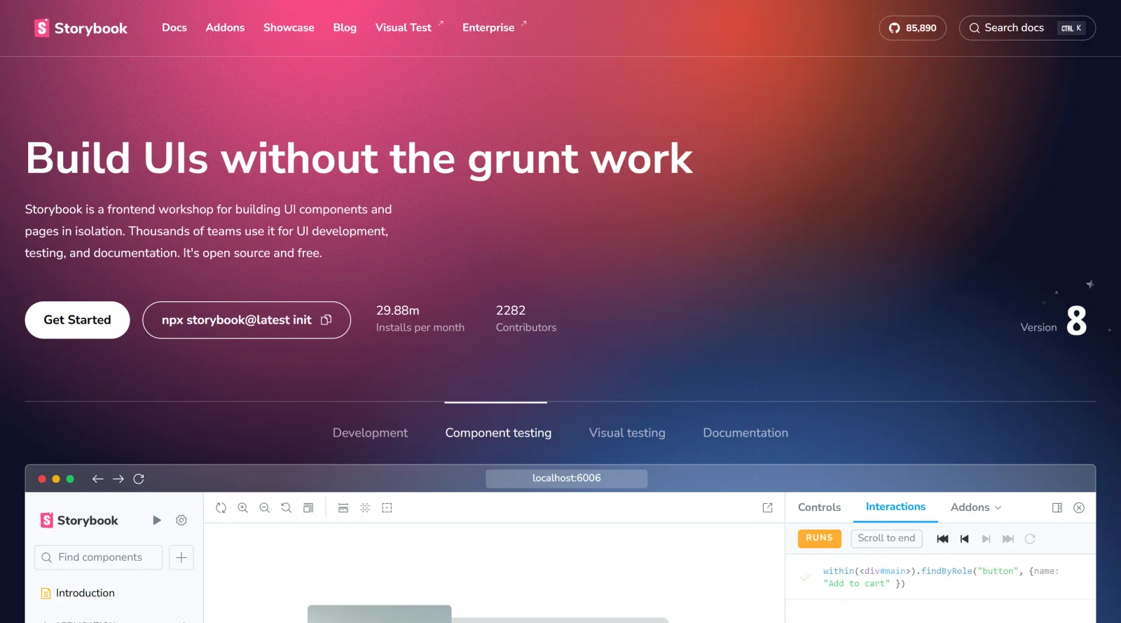
Storybook is an open-source tool in the design-tools category that enables developers to develop UI components in isolation from the main application. It serves as a frontend workshop environment where components can be built, viewed, and tested independently, without requiring a full development stack or app dependencies. As a free tool, Storybook fits into the design and development workflow by allowing teams to focus on individual UI elements early in the process, supporting frameworks like React, Vue, Angular, and others. This isolation helps maintain consistency across UI components while facilitating documentation and reuse within projects.
What Storybook Does
- Provides an isolated environment to render and develop UI components without running the entire application.
- Generates stories that represent different states and variations of components for preview and testing.
- Supports documentation generation from component stories, creating usage guidelines and design system references.
- Integrates with testing tools like Jest, Vitest, Testing Library, Playwright, and Chromatic for visual and interaction testing.
- Offers controls for dynamic prop modification, enabling interactive previews of component behaviors and states.
- Works with multiple frontend frameworks including React, Vue, Angular, Svelte, and Ember.
How Storybook Can Be Used
- Developers build modular UI components using component-driven development, starting with basic elements like buttons and progressing to composite screens.
- Teams document components through stories, which serve as a catalog for reuse across projects and automatic generation of UI libraries.
- Designers and developers test edge cases and interactions in isolation, such as form validations or button states, without app interference.
- Integrate Storybook instances with design tools like UXPin Merge to sync React components for high-fidelity prototyping.
- Publish Storybook to share component libraries with stakeholders, embedding stories in tools like Figma or Notion for collaboration.
Who Is Storybook For?
Storybook serves frontend developers working on UI components, particularly those using JavaScript frameworks in team environments where design consistency is key. It suits developers at various experience levels building scalable web applications, design system maintainers creating reusable component libraries, and cross-functional teams bridging design and development workflows. UX designers benefit from its interactive previews when paired with prototyping tools. Projects involving complex UIs with multiple states and interactions find Storybook useful for isolated development and testing. Visit Storybook
Featured Tools
Sponsored
Artlist
Royalty-free music, SFX, 8K footage, templates, LUTs and 100+ AI models on a single subscription for video creators.

Icons8
Large icon packs featuring over 10,000 icons for consistent design themes.

Vidu
AI video generator with text, image and reference-to-video modes, producing 3–16 second clips at up to 1080p with characters that stay consistent across shots.
Your tool here
The tools above are our own picks until the slots sell.
Spotlight
SponsoredRotates daily
HyNote
Records and transcribes interviews and meetings, then turns them into summaries and action items.
Tools we recommend

getimg.ai
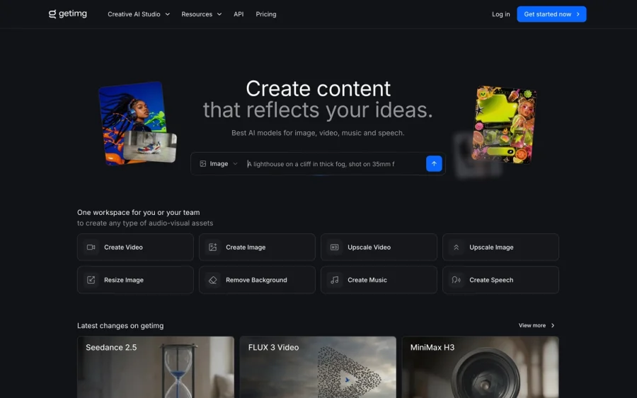
20+ AI models for image, video & audio in one workspace

OpenArt
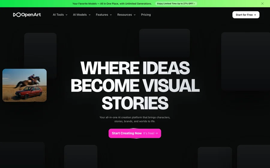
All-in-one AI image, video & audio generator


YouCam Online Editor
Free online AI photo & video editor
Editorially chosen. Some links above are affiliate links — if you sign up we may earn a commission, at no extra cost to you.
More Design Tools Tools

Pryzm
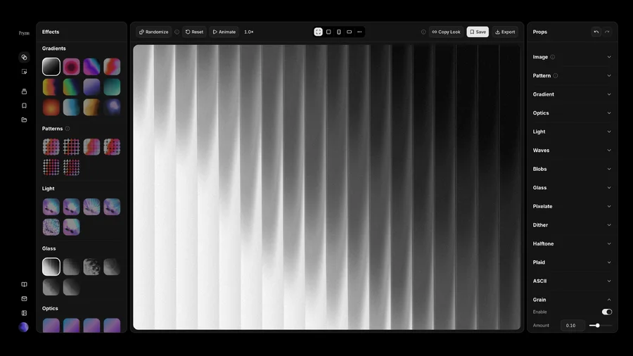
Pryzm is a real-time studio for designers who need backgrounds that don't look like everyone else's. Layer procedural gradients, then stack glass, grain, light and blobs.
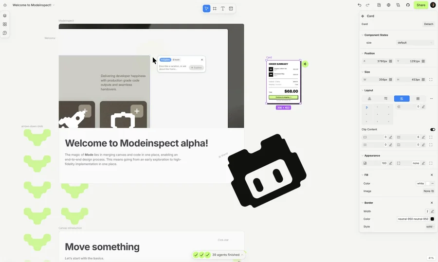

Modeinspect
Mode turns your product’s codebase into editable canvas frames. Refine real UI with visual controls, experiment with AI then share or hand off for review.
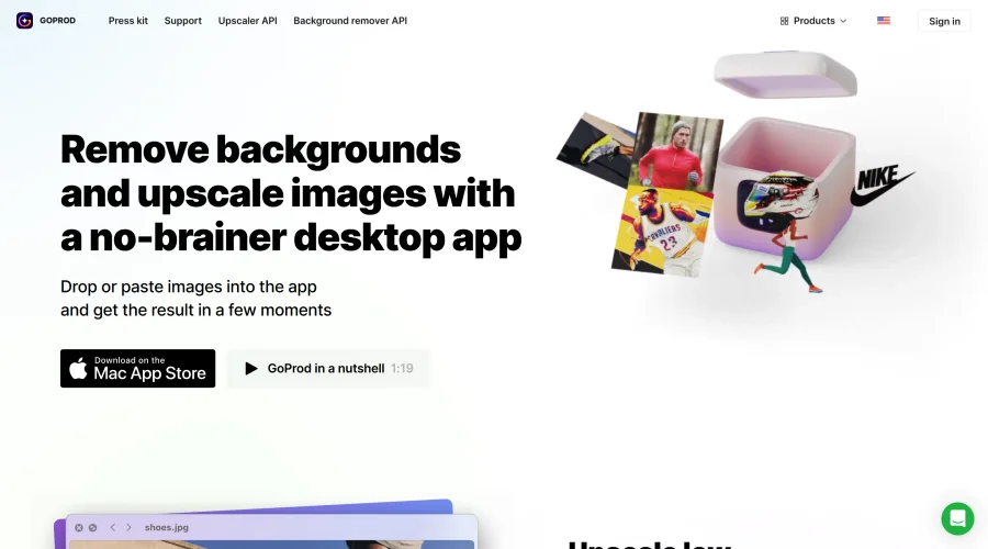

GoProd
Remove backgrounds and upscale images effectively.
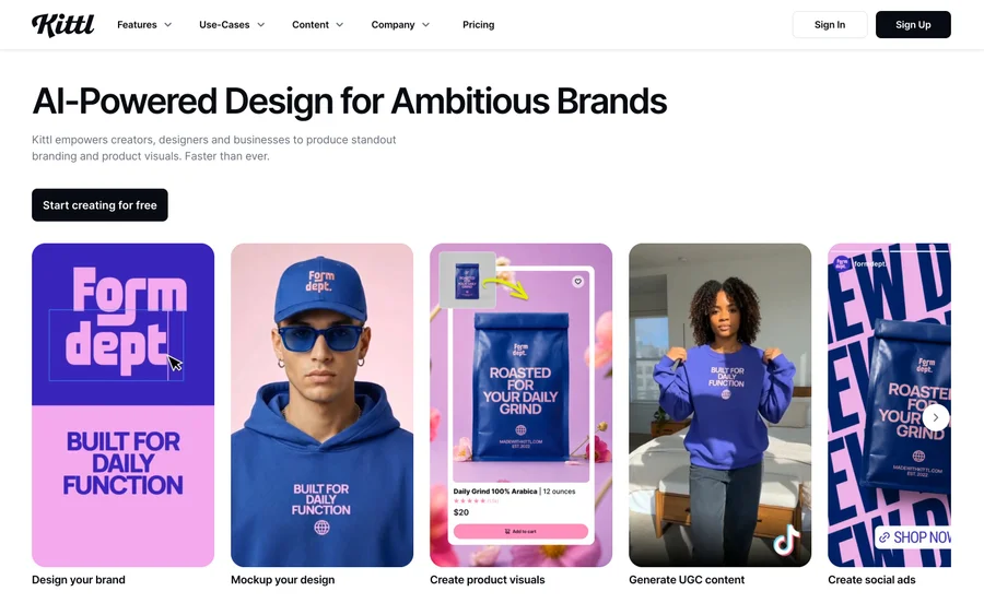

Kittl
AI-first design platform with image, vector, and video generation, plus templates, mockups, and print-ready exports.
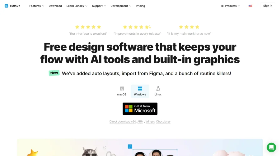

Lunacy
Free design software enhanced with AI tools and built-in graphics.

Smart Upscaler
Automatically improve image clarity using AI technology.
Explore Other Categories
Discover more design resources
New to Design?
Explore our comprehensive design glossary to master essential terminology from A/B Testing to Wireframes.
Browse GlossaryLooking for something specific?
Search through our entire collection of design tools and resources