

Reference guide for building component-based user interfaces.
What it costs
- Free tier
- Yes
Free reference gallery of UI components and design systems; no paid plan.
Auto-checked on 8 August 2026Source
About The Component Gallery
What Is The Component Gallery?
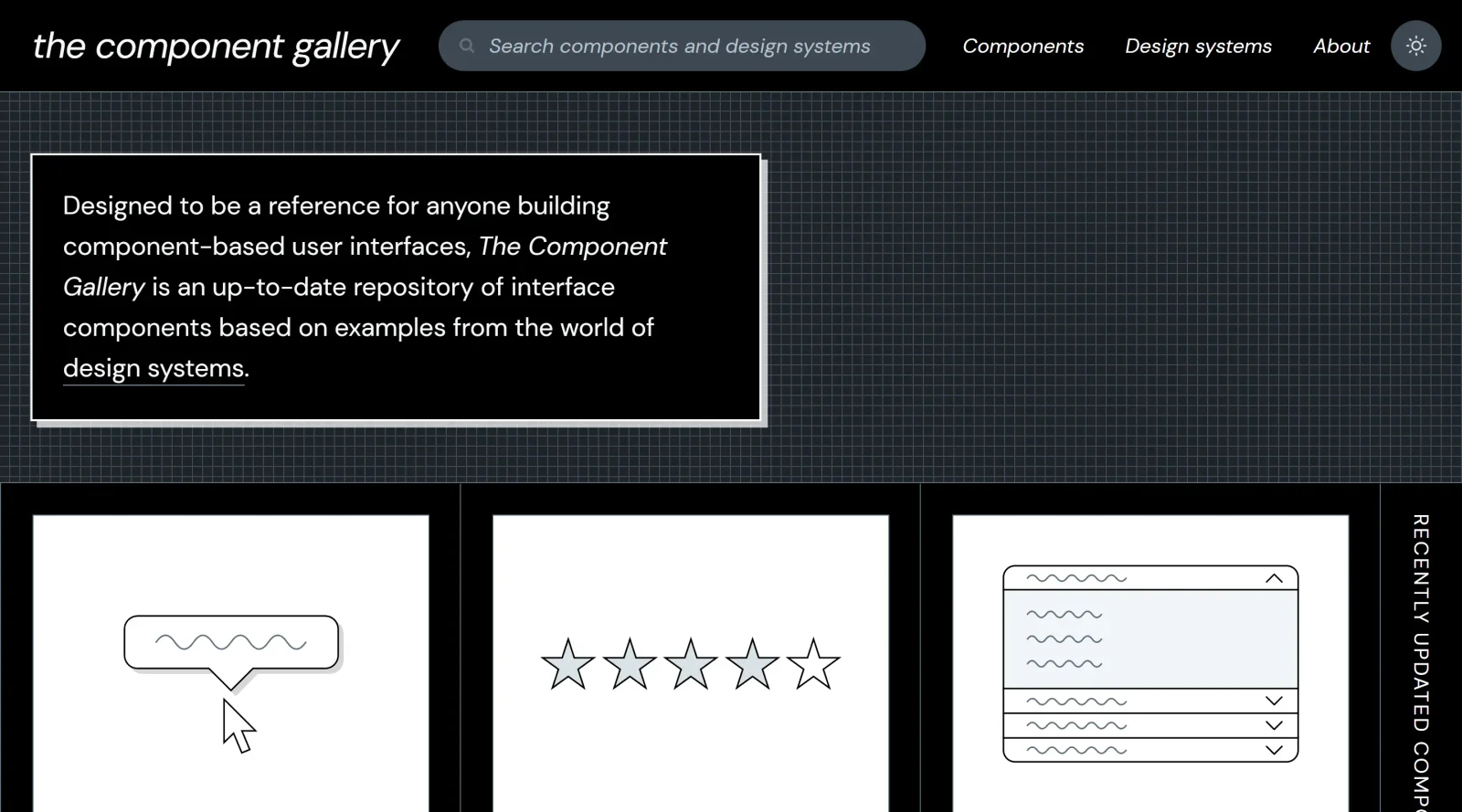
The Component Gallery is a free educational reference guide for building component-based user interfaces. It serves as a collection of reusable UI components and design patterns drawn from real-world design systems, allowing designers and developers to browse examples without recreating common elements from scratch. As an educational resource in the design workflow, The Component Gallery fits early in the process, during research and inspiration phases, where teams explore established solutions for interface problems before implementation.
What The Component Gallery Does
- Provides a library of UI components such as buttons, cards, checkboxes, modals, and sliders from multiple design systems.
- Offers design specifications and documentation detailing component structure, interactions, and best practices.
- Includes code implementations for frameworks like React, Vue, and Angular to support direct integration.
- Supports browsing by component type, with examples spanning navigation, forms, data displays, and overlays.
- Features components from over 90 design systems, enabling comparison across different approaches.
- Allows filtering and searching to locate specific UI patterns or interaction types efficiently.
How The Component Gallery Can Be Used
- Designers reference component examples during ideation to select patterns for headers, forms, or carousels in new projects.
- Developers copy code snippets for buttons or tables, adapting them to match project requirements and accelerate frontend builds.
- Teams building design systems compare implementations across sources to ensure consistency in elements like drawers or date pickers.
- Individuals study real-world solutions for accessibility features, such as skip links or keyboard-navigable menus, before custom development.
- Workflow integration involves searching for a component, reviewing specs and code, then customizing for prototypes or production UIs.
Who Is The Component Gallery For?
The Component Gallery targets designers seeking UI component inspiration and reference materials, frontend developers implementing interfaces with reusable code, and design system teams maintaining consistent patterns across projects. It suits intermediate to advanced users handling component-based workflows, as well as those new to specific UI challenges who benefit from established examples. Experience levels range from developers avoiding reinvention of common elements to teams prioritizing reusability in productivity-focused environments.Visit The Component Gallery
Featured Tools
Sponsored
Artlist
Royalty-free music, SFX, 8K footage, templates, LUTs and 100+ AI models on a single subscription for video creators.

Icons8
Large icon packs featuring over 10,000 icons for consistent design themes.

Vidu
AI video generator with text, image and reference-to-video modes, producing 3–16 second clips at up to 1080p with characters that stay consistent across shots.
Your tool here
The tools above are our own picks until the slots sell.
Spotlight
SponsoredRotates daily
HyNote
Records and transcribes interviews and meetings, then turns them into summaries and action items.
More Educational Tools

10x Designers
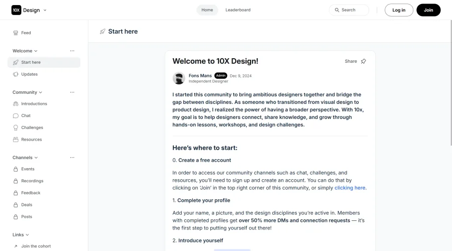
Broaden your design skills with this resource.


AJ Smart
Premier resource for UX/UI, design sprints, and design thinking.

Android Design Hub
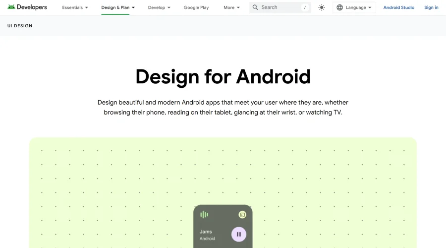
Android UI design best practices for creating beautiful interfaces.

Baseline
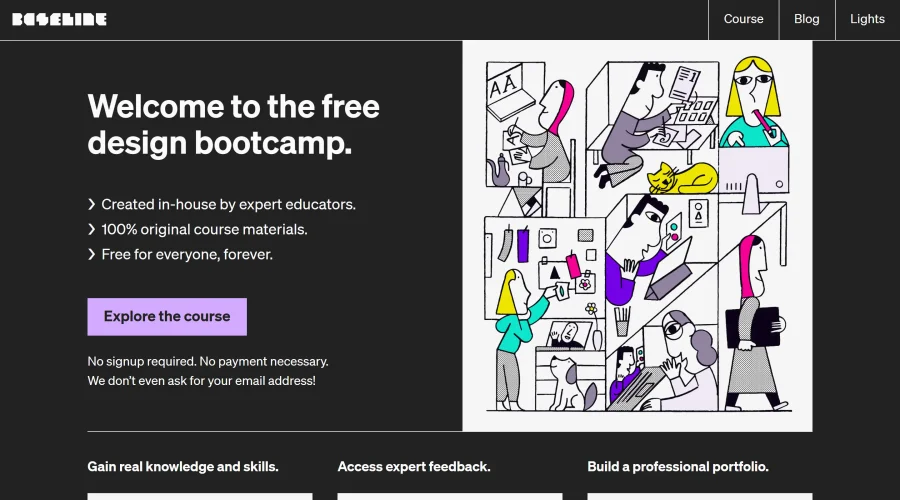
Expertly crafted free design bootcamp for skill enhancement.
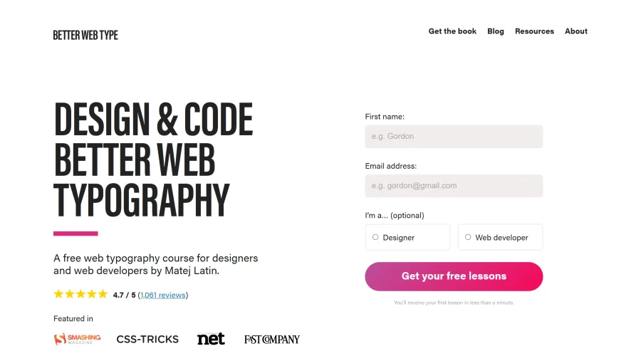

Better Web Type
Complimentary web typography course for designers and developers.
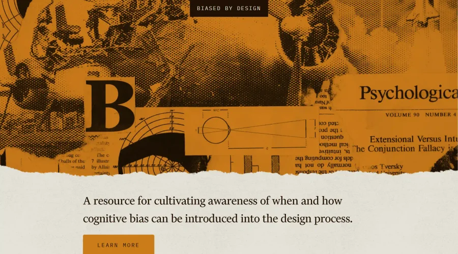

Biased by Design
Insights on recognizing and countering cognitive bias in design.
Explore Other Categories
Discover more design resources
New to Design?
Explore our comprehensive design glossary to master essential terminology from A/B Testing to Wireframes.
Browse GlossaryLooking for something specific?
Search through our entire collection of design tools and resources