


What it costs
- Free tier
- Yes
Free browsable component library; paid Figma Kits and a Pricing page exist but no prices appear on the homepage.
Auto-checked on 8 August 2026Source
About UI Guideline
What Is UI Guideline?
UI Guideline is a free educational resource that provides a guide for standardized naming and definition of UI components. It compiles detailed information on common UI patterns drawn from leading design systems, serving as a reference in the design and development workflow. Designers and developers use UI Guideline during the planning and documentation stages to ensure consistency in component nomenclature and structure across projects.
What UI Guideline Does
- Offers detailed breakdowns of over 60 unique UI components, including props, anatomy, and alternative names.
- Analyzes components from 20 prominent design systems and UI libraries to provide synthesized references.
- Enables identification of common UI patterns in a centralized location for quick lookup.
- Supports standardization of design and code for UI components based on established systems.
- Reduces research time by aggregating insights from multiple reference sources into single component files.
- Covers components such as buttons, calendars, modals, search fields, toggles, alerts, color pickers, empty states, and ratings.
How UI Guideline Can Be Used
- Consult UI Guideline when defining a new Sidebar component by reviewing synthesized details from top systems, avoiding the need to check each system individually.
- Reference it in team handoffs between designers and developers to align on component naming and properties for consistent implementation.
- Use during design system audits to compare project components against industry standards for naming and structure.
- Incorporate into prototyping workflows to select standardized names and anatomies for UI elements like modals or toggles.
- Apply in documentation processes to create comprehensive specs for components, including examples from open-source design systems and pattern libraries.
Who Is UI Guideline For?
UI Guideline serves UI designers, front-end developers, and design system maintainers who need reliable references for component standardization. It fits teams working on web applications or interfaces requiring consistent UI patterns, particularly those adopting or building design systems. Junior designers benefit from its compiled insights to learn industry naming conventions, while experienced professionals use it to streamline research and ensure alignment with established practices. Visit UI Guideline
Featured Tools
Sponsored
Artlist
Royalty-free music, SFX, 8K footage, templates, LUTs and 100+ AI models on a single subscription for video creators.

Icons8
Large icon packs featuring over 10,000 icons for consistent design themes.

Vidu
AI video generator with text, image and reference-to-video modes, producing 3–16 second clips at up to 1080p with characters that stay consistent across shots.
Your tool here
The tools above are our own picks until the slots sell.
Spotlight
SponsoredRotates daily
HyNote
Records and transcribes interviews and meetings, then turns them into summaries and action items.
More Educational Tools
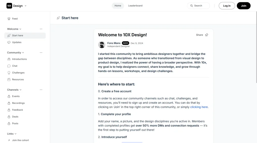

10x Designers
Broaden your design skills with this resource.


AJ Smart
Premier resource for UX/UI, design sprints, and design thinking.
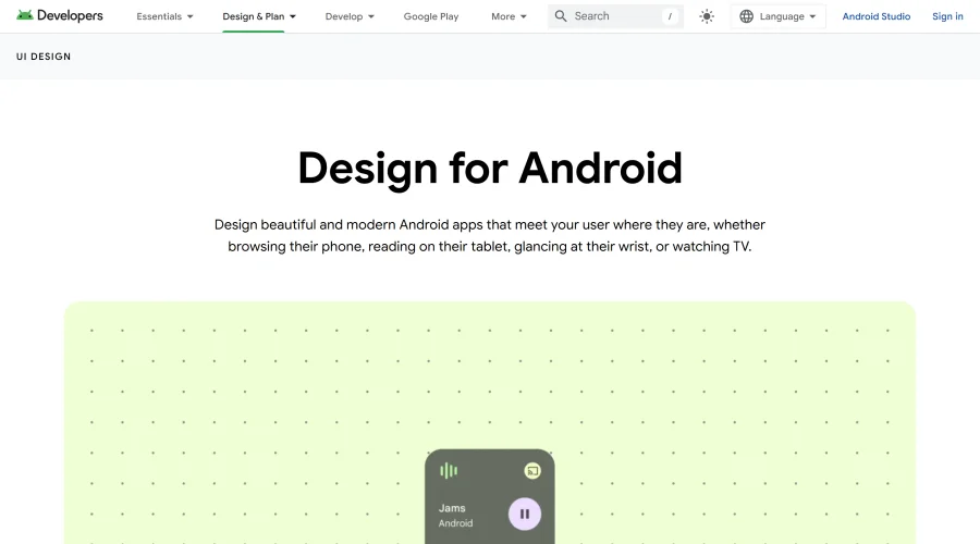

Android Design Hub
Android UI design best practices for creating beautiful interfaces.


Baseline
Expertly crafted free design bootcamp for skill enhancement.
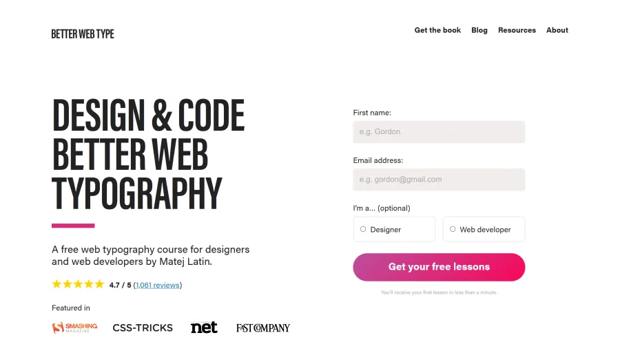

Better Web Type
Complimentary web typography course for designers and developers.
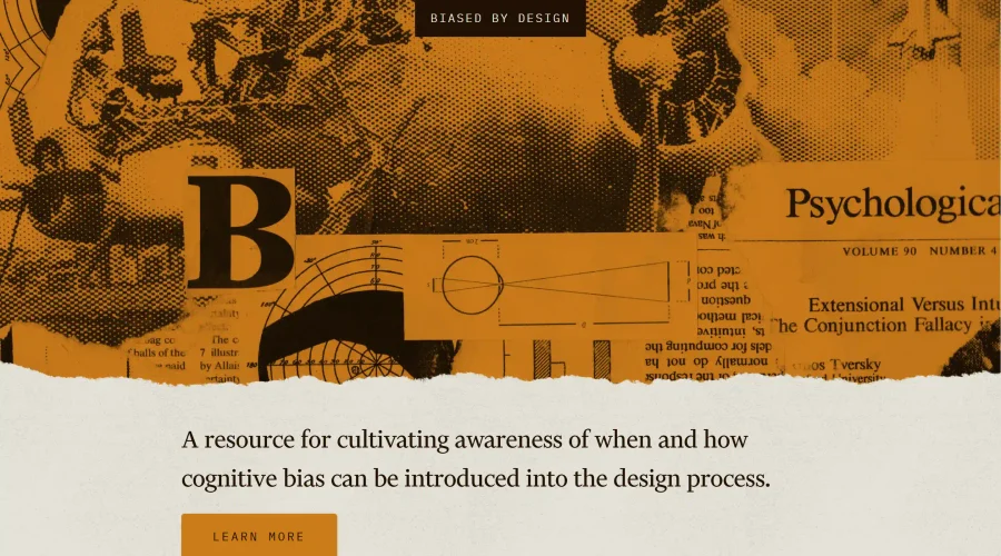

Biased by Design
Insights on recognizing and countering cognitive bias in design.
Explore Other Categories
Discover more design resources
New to Design?
Explore our comprehensive design glossary to master essential terminology from A/B Testing to Wireframes.
Browse GlossaryLooking for something specific?
Search through our entire collection of design tools and resources