© 2026 usetools. All rights reserved.
Presenting data in charts, graphs, or infographics to make information clear and actionable.
Data visualization is the process of presenting data in a visual format, such as charts, graphs, or infographics, to make complex information clear and actionable. This technique transforms raw data into digestible insights, enhancing user understanding and decision-making. In the context of UX/UI and design, data visualization plays a crucial role in communicating data-driven insights effectively.
Data visualization offers several benefits, including:
Common types of data visualizations include:
In SEO, data visualization can enhance performance by:
In UX/UI and design, data visualization is used to:
To effectively use data visualization:
Several tools are available for creating effective data visualizations, including:
Data visualization is a powerful tool in UX/UI and design, enabling the effective communication of complex data insights. By leveraging various types of visualizations and best practices, designers can enhance user experience, inform design decisions, and drive data-driven strategies. Whether in SEO or design, data visualization transforms raw data into actionable insights, making it an indispensable technique in today's data-rich environment.
Discover tools that help you apply data visualization in your work.

The design glossary is just the beginning. Explore more terms, discover tools, and level up your design skills.
Designing products and interfaces usable by people with varying abilities (e.g., vision, motor, cognitive).
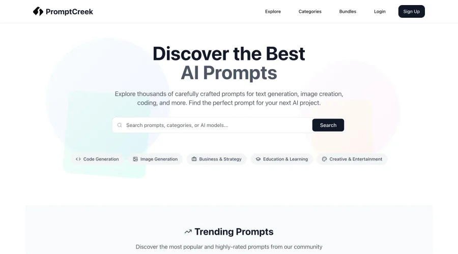
Prompt Creek is a free community-driven repository featuring thousands of AI prompts. Discover, bookmark, and share quality prompts for ChatGPT, Claude, and other AI tools.