© 2026 usetools. All rights reserved.
Creating distinct layouts tailored for specific screen sizes rather than using one responsive layout.
Adaptive design is a web design approach that involves creating multiple distinct layouts tailored for specific screen sizes. Unlike responsive design, which uses a single layout that adjusts to different screen sizes, adaptive design offers a more precise fit by selecting the most appropriate layout based on the device's screen size. This method ensures an optimized user experience across various devices, from smartphones to desktops.
Adaptive design is a powerful tool for enhancing user experience by providing tailored solutions for different devices. While it requires more effort and resources than responsive design, the benefits include a highly optimized and contextually relevant user interface. By understanding the strengths and limitations of adaptive design, designers can create more effective and user-friendly websites.
Discover tools that help you apply adaptive design in your work.

The design glossary is just the beginning. Explore more terms, discover tools, and level up your design skills.
Designing products and interfaces usable by people with varying abilities (e.g., vision, motor, cognitive).
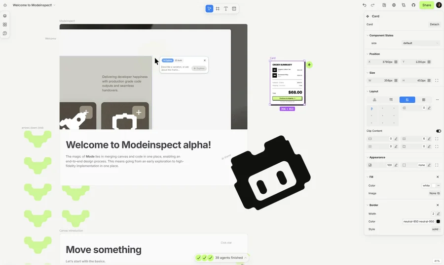
Mode turns your product’s codebase into editable canvas frames. Refine real UI with visual controls, experiment with AI then share or hand off for review.