© 2026 usetools. All rights reserved.
The degree of difference in color, tone, or shape between elements, improving readability and hierarchy.
Contrast is a fundamental principle in UX/UI and design, referring to the degree of difference in color, tone, or shape between elements. It plays a crucial role in enhancing readability and establishing a clear visual hierarchy, which are essential for effective communication and user engagement. By using contrast, designers can guide the user's attention, highlight important information, and create visually appealing interfaces.
In summary, contrast is a powerful tool in UX/UI and design that enhances readability, creates visual hierarchy, and improves user engagement. By understanding and effectively applying contrast principles, designers can create more impactful and user-friendly designs. Whether through color, size, shape, or texture, contrast is essential for making a design both aesthetically pleasing and functional.
Discover tools that help you apply contrast in your work.
The design glossary is just the beginning. Explore more terms, discover tools, and level up your design skills.
Designing products and interfaces usable by people with varying abilities (e.g., vision, motor, cognitive).
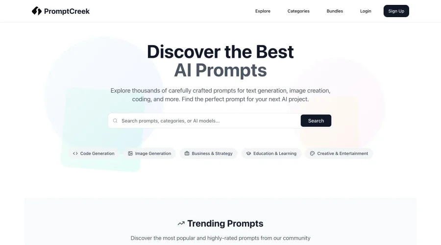
Prompt Creek is a free community-driven repository featuring thousands of AI prompts. Discover, bookmark, and share quality prompts for ChatGPT, Claude, and other AI tools.