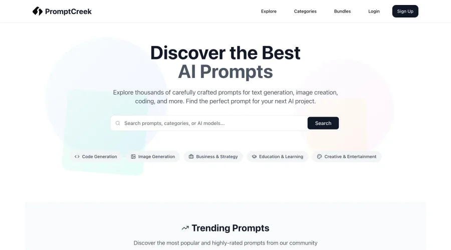
Contrast
The degree of difference in color, tone, or shape between elements, improving readability and hierarchy.
What is Contrast in Graphic Design?
Contrast is a fundamental principle in UX/UI and design, referring to the degree of difference in color, tone, or shape between elements. It plays a crucial role in enhancing readability and establishing a clear visual hierarchy, which are essential for effective communication and user engagement. By using contrast, designers can guide the user's attention, highlight important information, and create visually appealing interfaces.
Role of Contrast in Readability
- Visual Hierarchy: Contrast helps establish a visual hierarchy by making certain elements stand out more than others. This hierarchy is important for guiding the user's attention through the content and ensuring that key information is noticed first.
- Color Contrast: Color contrast is one of the most common forms of contrast used in design. It involves selecting colors that have sufficient lightness and saturation differences to ensure text and backgrounds are easily distinguishable. The WCAG guidelines provide a framework for achieving accessible color contrast, ensuring that content is readable by users with visual impairments.
- Tonal Contrast: Tonal contrast refers to the difference in brightness between elements. It is crucial for creating depth and dimension in a design, making it more engaging and easier to navigate.
Types of Contrast
- Color Contrast: This involves using different colors to create visual interest and distinguish between elements. It is essential for readability, especially for text on backgrounds.
- Size Contrast: Elements of different sizes can create contrast, helping to draw attention to specific parts of the design.
- Shape Contrast: Using different shapes can add variety and interest to a design, making it more dynamic.
- Texture Contrast: Incorporating different textures can enhance the tactile feel of a design, even in digital formats.
Best Practices for Implementing Contrast
- Balance: While contrast is important, it should be balanced with harmony to avoid visual overload. Too much contrast can make a design look cluttered or chaotic.
- Consistency: Consistently applying contrast principles throughout a design helps maintain a cohesive look and feel.
- Accessibility: Ensure that the contrast used complies with accessibility guidelines to make the design usable for everyone.
- Contextual Use: Use contrast in context to emphasize specific elements or information. This can vary based on the purpose of the design.
Tools and Resources for Designing with Contrast
- Color Pickers: Tools like Adobe Color or Color Hunt can help designers select colors with optimal contrast.
- Design Software: Most design software, such as Sketch or Figma, includes features to analyze and adjust contrast levels.
- Accessibility Guidelines: Resources like the Web Content Accessibility Guidelines (WCAG) provide standards for ensuring sufficient contrast for accessibility.
Conclusion
In summary, contrast is a powerful tool in UX/UI and design that enhances readability, creates visual hierarchy, and improves user engagement. By understanding and effectively applying contrast principles, designers can create more impactful and user-friendly designs. Whether through color, size, shape, or texture, contrast is essential for making a design both aesthetically pleasing and functional.
Explore Design Tools
Discover tools that help you apply contrast in your work.
Continue Your Learning Journey
The design glossary is just the beginning. Explore more terms, discover tools, and level up your design skills.


