What is Proximity in Design?
The principle of proximity is a fundamental concept in design and UX/UI, emphasizing the importance of grouping related items and separating unrelated ones to enhance scannability and establish a clear hierarchy. This Gestalt principle helps users perceive elements that are close together as more related, regardless of their differences in color, shape, or size.
Benefits of Proximity
- Improved Organization: By grouping related items together, designers create more organized and clean interfaces, making it easier for users to understand which elements are related and which are separate.
- Enhanced Usability: Proximity makes interfaces more intuitive by indicating the relatedness of grouped elements, such as buttons or functions, which helps users learn and remember how to use a product.
- Efficient Information Processing: Grouping information according to proximity reduces cognitive load, allowing users to quickly process and interpret grouped information without evaluating each element individually.
- Visual Hierarchy: Proximity helps establish a visual hierarchy, guiding users' attention to where it's needed most and improving the effectiveness of the design.
- Error Reduction: Grouping related options or controls lowers the likelihood of users making errors, as similar or related options are clearly associated.
Applications of Proximity
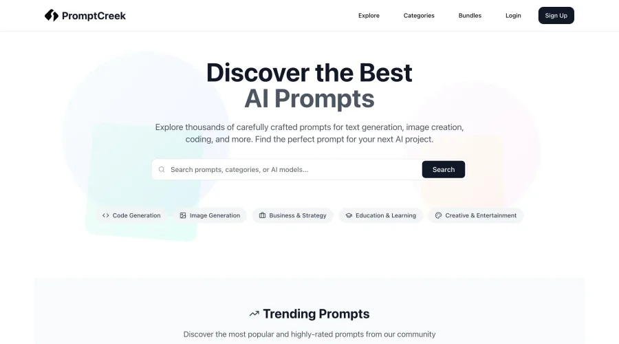
- Navigation Menus: In web navigation, related items are grouped together based on proximity, helping users identify and select options without confusion.
- Form Fields: Related fields in forms, such as first and last name, are placed close to each other, indicating their relatedness.
- Content Grouping: Articles often use proximity to group paragraphs, headings, and images, making content more readable and engaging.
Design Strategies
- Consistency: Consistent application of proximity helps users process and understand layouts by maintaining a pattern in distances between groups and elements.
- Enhance Grouping and Organization: Proximity organizes information by creating groups within groups, visually showing relationships between elements.
- Improve Scannability: Adequate spacing between elements enhances scannability in forms and prevents confusion by making it easy for users to associate labels with corresponding fields.
Strategic Use in UI/UX Design
In UI/UX design, proximity is crucial for creating user-friendly and intuitive interfaces. Designers use proximity to guide users' attention, focus, and navigation, making digital products more engaging and user-friendly. By applying proximity effectively, designers can infuse their interfaces with order, hierarchy, and structure, which ultimately enhances user experience.
Practical Examples
- Image and Caption Proximity: Captions are typically placed directly beneath or adjacent to images, helping readers associate each caption with its corresponding image.
- White Space Use: Ample white space between images can signal that they pertain to separate subjects, providing visual cues for differentiation.
Conclusion
The law of proximity is a powerful tool in design, enabling the creation of visually cohesive and organized layouts. By strategically grouping related elements and separating unrelated ones, designers can significantly improve the user experience by enhancing readability, usability, and overall interaction with digital products.