Data Visualization
Presenting data in charts, graphs, or infographics to make information clear and actionable.
Data Visualization
Data visualization is the process of presenting data in a visual format, such as charts, graphs, or infographics, to make complex information clear and actionable. This technique transforms raw data into digestible insights, enhancing user understanding and decision-making. In the context of UX/UI and design, data visualization plays a crucial role in communicating data-driven insights effectively.
Benefits of Data Visualization
Data visualization offers several benefits, including:
- Enhanced Understanding: Visual representations of data facilitate quicker comprehension compared to raw data, as humans process images much faster than text.
- Improved Decision-Making: By presenting data in a clear and concise manner, data visualization enables stakeholders to make informed decisions based on actionable insights.
- Increased Engagement: Visualizations, especially interactive ones, can significantly boost user engagement by making data more accessible and interesting.
Types of Data Visualizations
Common types of data visualizations include:
- Infographics: Combine text, images, and statistics to convey information in an engaging and shareable format.
- Bar and Column Charts: Useful for comparing data across categories or time periods.
- Pie Charts: Effective for showing proportions and percentages.
- Line Graphs: Ideal for illustrating trends over time.
- Scatter Plots: Illustrate the relationship between two variables.
- Tables: Organize complex data, though they are less visually engaging.
- Heatmaps: Show the intensity of a variable across a visual representation.
Data Visualization in SEO
In SEO, data visualization can enhance performance by:
- Increasing Engagement: Visual content improves user experience, leading to longer session times and lower bounce rates.
- Improving Click-Through Rates (CTR): Visuals in search results can increase CTR by making listings more appealing.
- Enhancing Shareability: Infographics and visualizations are highly shareable, which can lead to more backlinks.
Applications in UX/UI and Design
In UX/UI and design, data visualization is used to:
- Communicate Insights: Help designers understand user behavior and design trends.
- Optimize User Experience: Use visual data to identify areas of improvement in the user interface.
- Inform Design Decisions: Data-driven insights guide design choices, ensuring they are based on user needs.
Best Practices for Data Visualization
To effectively use data visualization:
- Keep it Simple: Ensure visualizations are clear and easy to understand.
- Use Interactive Elements: Engage users with interactive visualizations where possible.
- Tailor to Audience: Design visualizations that cater to the target audience's needs and preferences.
Tools for Data Visualization
Several tools are available for creating effective data visualizations, including:
- Tableau: Known for its ease of use and powerful visualization capabilities.
- Power BI: Offers advanced analytics and customization options.
- Google Data Studio: Integrates well with Google Analytics for seamless data visualization.
Conclusion
Data visualization is a powerful tool in UX/UI and design, enabling the effective communication of complex data insights. By leveraging various types of visualizations and best practices, designers can enhance user experience, inform design decisions, and drive data-driven strategies. Whether in SEO or design, data visualization transforms raw data into actionable insights, making it an indispensable technique in today's data-rich environment.
Explore Other Terms
A/B Testing (Split Testing)
ResearchComparing two versions of a design or feature to see which performs better.
Accessibility
UXDesigning products and interfaces usable by people with varying abilities (e.g., vision, motor, cognitive).
Accessibility Tree
UXA structure that assistive tech (like screen readers) uses to interpret and convey interface elements to users.
Adaptive Design
UICreating distinct layouts tailored for specific screen sizes rather than using one responsive layout.
Aspect Ratio
UI / GraphicThe proportional relationship between width and height of an image or screen (e.g., 16:9).
Atomic Design
UIA methodology breaking UIs into basic building blocks (atoms, molecules, organisms) for consistency and scalability.
Explore Design Tools
Discover tools that help you apply data visualization in your work.
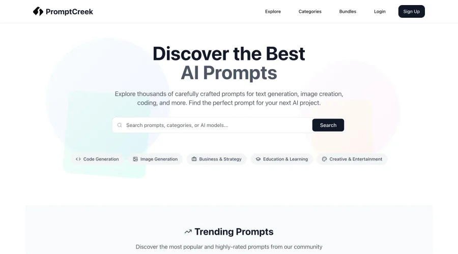

PromptCreek
Prompt Creek is a free community-driven repository featuring thousands of AI prompts. Discover, bookmark, and share quality prompts for ChatGPT, Claude, and other AI tools.
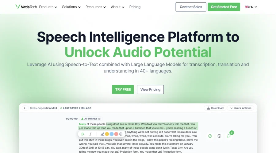

Vatis Tech
Vatis Tech is the most powerful speech-to-text infrastructure. It can be used to transcribe user interviews and client meetings.
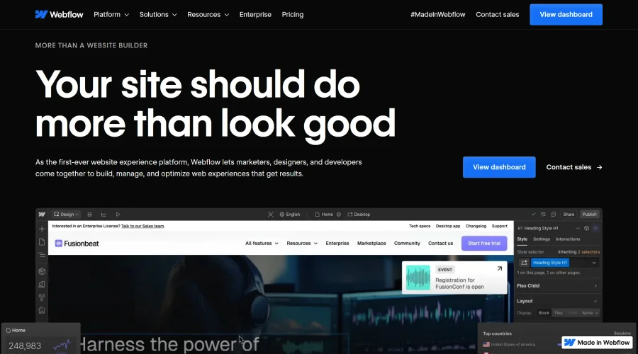

Webflow
Accelerate website creation without needing to code.
Continue Your Learning Journey
The design glossary is just the beginning. Explore more terms, discover tools, and level up your design skills.