© 2026 usetools. All rights reserved.
A typeface is a family (e.g., Helvetica), while a font is a specific style/weight (e.g., Helvetica Bold, 12pt).
In the realm of typography, understanding the distinction between a font and a typeface is crucial for designers and communicators alike. This glossary entry delves into the definitions and differences between these two fundamental terms, providing clarity on their roles in graphic design and digital communication.
A typeface refers to a family of fonts that share a common design aesthetic. It encompasses various styles, weights, and sizes, all aligning under a unified visual identity. For instance, Helvetica is a typeface that includes multiple fonts like Helvetica Regular, Helvetica Bold, and Helvetica Italic. Typefaces provide a consistent visual language that designers use to convey messages effectively.
A font, on the other hand, is a specific variant within a typeface. It specifies the size, weight, and style of the text. For example, Helvetica Bold or Helvetica Italic are fonts within the Helvetica typeface. Fonts determine how the typeface appears in practice, influencing readability, style, and mood.
The terms font and typeface have their roots in traditional printing. Historically, a font referred to a set of metal type pieces, while a typeface was the overall design of those pieces. With digital typesetting, these distinctions have evolved, but the essence remains: a typeface is the broader design concept, while a font is a specific implementation of that design.
In design and communication, understanding the difference between fonts and typefaces is essential for maintaining consistency and achieving desired visual effects. Brands often specify typefaces and fonts in their guidelines to ensure a unified visual identity across all media.
In summary, while often used interchangeably, fonts and typefaces serve distinct roles in typography. A typeface provides a cohesive visual identity, while a font specifies how that identity is presented in terms of size, weight, and style. This distinction is vital for effective communication and design consistency in UX/UI and graphic design projects.
Discover tools that help you apply font vs. typeface in your work.

The design glossary is just the beginning. Explore more terms, discover tools, and level up your design skills.
Designing products and interfaces usable by people with varying abilities (e.g., vision, motor, cognitive).
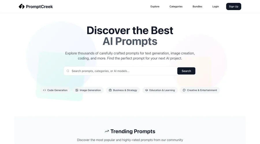
Prompt Creek is a free community-driven repository featuring thousands of AI prompts. Discover, bookmark, and share quality prompts for ChatGPT, Claude, and other AI tools.