
Kerning
Adjusting the space between individual characters in typography to achieve a visually pleasing result.
What is Kerning in Typography?
Kerning is the process of adjusting the space between individual characters in typography to create a visually pleasing and harmonious layout. It plays a crucial role in enhancing readability and aesthetics in digital and print media. By optimizing the spacing between letters, kerning helps ensure that text appears balanced and professional, which is particularly important in UX/UI and design contexts.
Importance of Kerning
Kerning is vital for creating a seamless and polished visual experience. It prevents characters from appearing too close or too far apart, which can lead to misinterpretation or visual discomfort. For instance, poorly kerned text can make the letters "r" and "n" appear as an "m," affecting the clarity of the message.
Types of Kerning
There are several types of kerning used in typography:
- Metrics Kerning: Uses predefined kerning pairs built into the font to automatically adjust spacing. This method is efficient for large bodies of text.
- Optical Kerning: Adjusts spacing based on the shape of characters, providing a more refined and visually appealing outcome. It is often used for headings or display text.
- Manual Kerning: Involves manually adjusting the spacing between characters for precise control. This is ideal for logos or short text snippets where exact spacing is crucial.
- Contextual Kerning: Considers the spacing of more than two characters at once, offering a more nuanced approach to text layout.
Applications of Kerning
Kerning is essential in various design applications, including:
- Web Design: Kerning improves the readability and aesthetics of web content, enhancing user experience.
- Graphic Design: It is critical for creating professional-looking logos, business cards, and other visual materials.
- Typography: Kerning helps create harmonious text layouts, making it a fundamental skill for typographers and designers.
Best Practices for Kerning
To effectively use kerning, designers should focus on creating a balanced visual flow:
- Understand Font Metrics: Familiarize yourself with the built-in kerning pairs of your chosen font.
- Use Optical Kerning: Especially for display text or when precise control is needed.
- Manual Adjustment: For custom or critical text elements like logos.
By mastering kerning techniques, designers can elevate their typography skills, ensuring that text is not only readable but also visually appealing. This skill is indispensable in UX/UI design, where user experience is paramount.
Explore Other Terms
A/B Testing (Split Testing)
ResearchComparing two versions of a design or feature to see which performs better.
Accessibility
UXDesigning products and interfaces usable by people with varying abilities (e.g., vision, motor, cognitive).
Accessibility Tree
UXA structure that assistive tech (like screen readers) uses to interpret and convey interface elements to users.
Adaptive Design
UICreating distinct layouts tailored for specific screen sizes rather than using one responsive layout.
Alignment
GraphicArranging elements so their edges or centers line up, promoting order and unity.
Aspect Ratio
UI / GraphicThe proportional relationship between width and height of an image or screen (e.g., 16:9).
Explore Design Tools
Discover tools that help you apply kerning in your work.


Artlist
Royalty-free music, SFX, 8K footage, templates, LUTs and 100+ AI models on a single subscription for video creators.
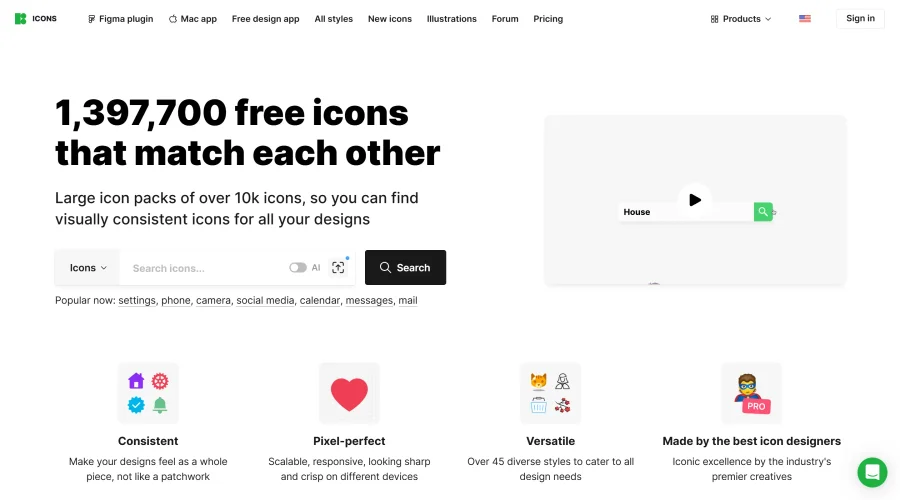

Icons8
Large icon packs featuring over 10,000 icons for consistent design themes.
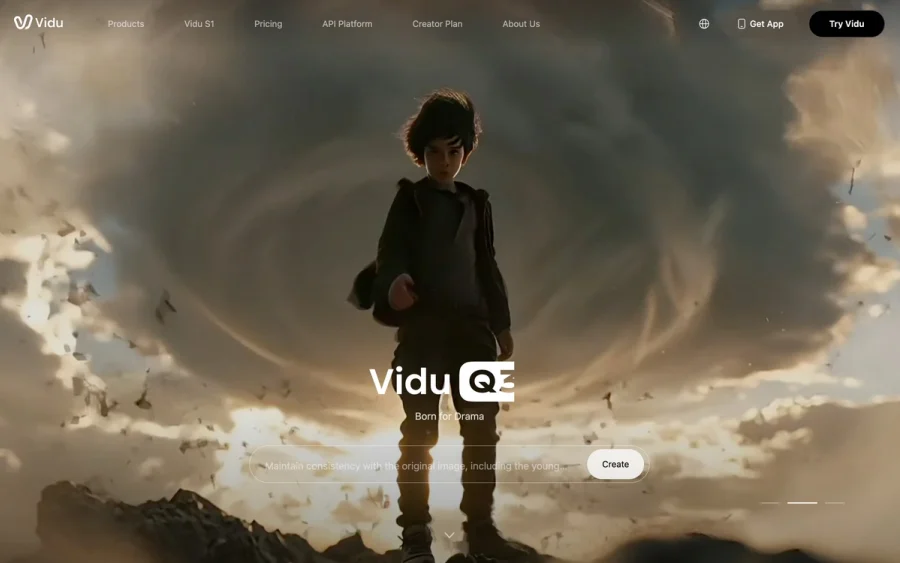

Vidu
AI video generator with text, image and reference-to-video modes, producing 3–16 second clips at up to 1080p with characters that stay consistent across shots.
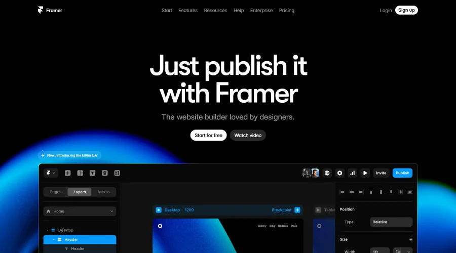

Framer
Design and launch your dream website with no coding required.
Continue Your Learning Journey
The design glossary is just the beginning. Explore more terms, discover tools, and level up your design skills.