

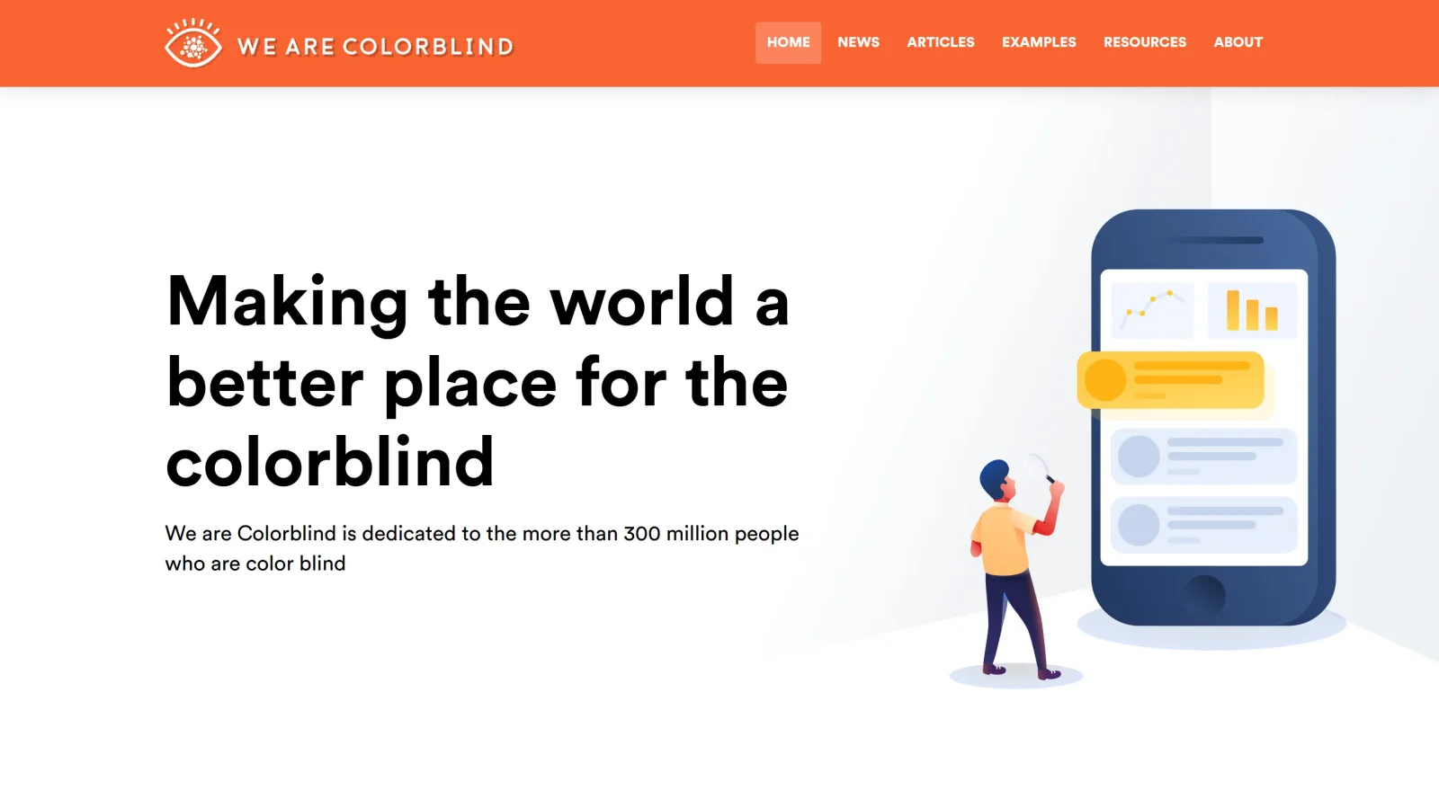
A collection of resources and articles aimed at improving accessibility for colorblind individuals.
What it costs
- Free tier
- Yes
Free educational resource/blog on color blindness; paid design-accessibility consulting services are offered separately.
Auto-checked on 8 August 2026Source
About We are Colorblind
What Is We are Colorblind?
We are Colorblind is a free collection of resources and articles focused on accessibility for colorblind individuals. It serves as an educational hub in the design workflow, helping designers and developers understand color vision deficiencies and apply inclusive practices during UI/UX creation, color selection, and content auditing. Available at no cost, We are Colorblind provides practical guidance to integrate colorblind-friendly techniques into projects without requiring software installation.
What We are Colorblind Does
- Compiles articles explaining types of color blindness, such as deuteranomaly and protanomaly, and their impact on perceiving reds, greens, and blues.
- Offers curated resources like style guides, including the Accessibility (A11Y) Style Guide, with accessible components linked to WCAG guidelines.
- Provides links to tools for simulating colorblind vision on web pages and designs.
- Shares best practices for using non-color cues, such as patterns, icons, textures, and text labels, alongside color.
- Features content on contrast checking and palette building to ensure readability for users with color vision deficiencies.
- Includes references to compliance standards like WCAG, ADA, and Section 508 for accessible color usage.
How We are Colorblind Can Be Used
- Designers reference We are Colorblind articles during palette selection to avoid red-green combinations that confuse colorblind users, pairing colors with high brightness contrast instead.
- Developers consult its resources when building forms, using icons and text alongside color for error indicators, such as exclamation marks with "required field" messages.
- Teams audit websites by applying linked simulators to preview pages under deuteranopia or tritanopia filters, identifying issues like low-contrast icons on backgrounds.
- Front-end developers integrate A11Y Style Guide components into projects for markup and CSS patterns that support keyboard navigation and screen readers.
- Accessibility specialists use the collection to train teams on redundant cues, ensuring graphs, buttons, and links remain distinguishable without relying on hue alone.
Who Is We are Colorblind For?
We are Colorblind targets UI/UX designers, front-end developers, and accessibility advocates working on web and digital products. It suits beginners learning colorblind accommodations and experienced professionals auditing for WCAG compliance, particularly in projects involving data visualization, e-commerce interfaces, or inclusive apps. Those addressing color vision deficiencies in team workflows or client sites find its resources directly applicable. Visit We are Colorblind
Featured Tools
Sponsored
Artlist
Royalty-free music, SFX, 8K footage, templates, LUTs and 100+ AI models on a single subscription for video creators.

Icons8
Large icon packs featuring over 10,000 icons for consistent design themes.

Vidu
AI video generator with text, image and reference-to-video modes, producing 3–16 second clips at up to 1080p with characters that stay consistent across shots.
Your tool here
The tools above are our own picks until the slots sell.

More Accesibility Tools
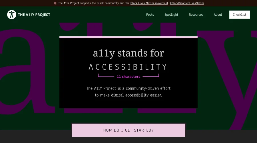

A11Y Project
A community-led initiative to simplify digital accessibility.
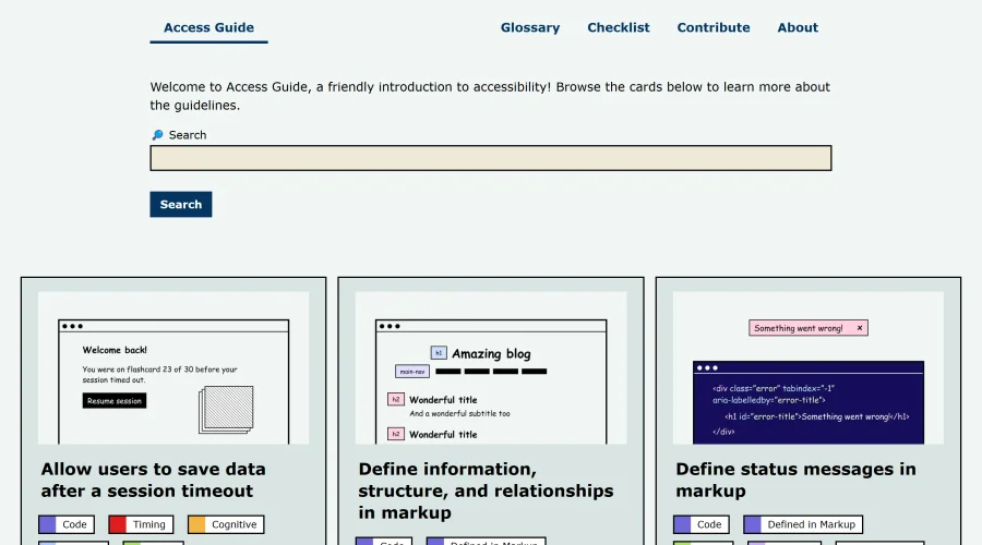
Access Guide
An easy-to-understand introduction to digital accessibility.
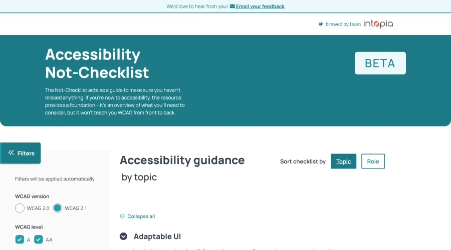

Accessibility Not-Checklist
Comprehensive guide to ensure accessibility in design projects.
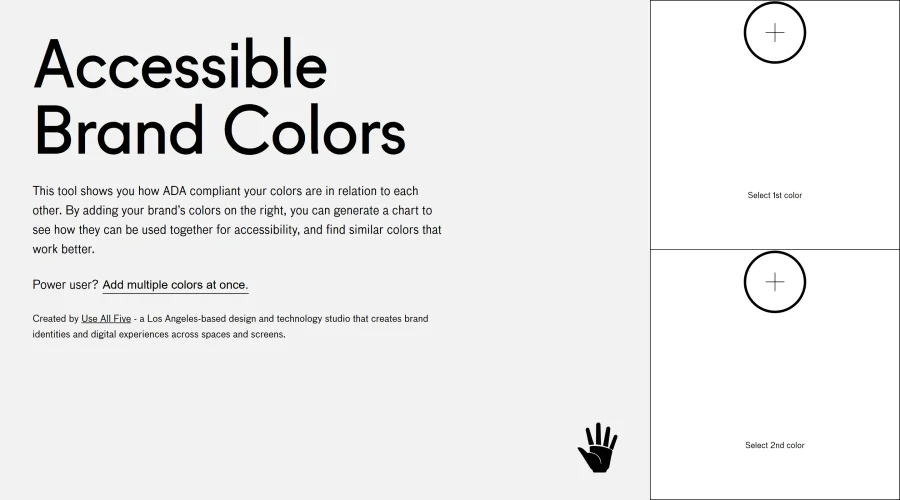

Accessible Brand Colors
A tool assessing ADA compliance of color contrasts.
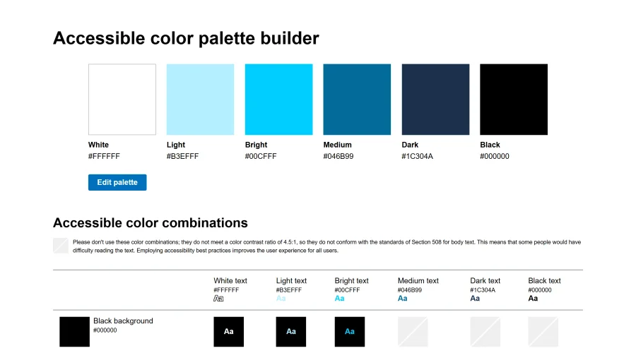

Accessible Color Matrix
A design tool for creating color palettes that meet accessibility standards.
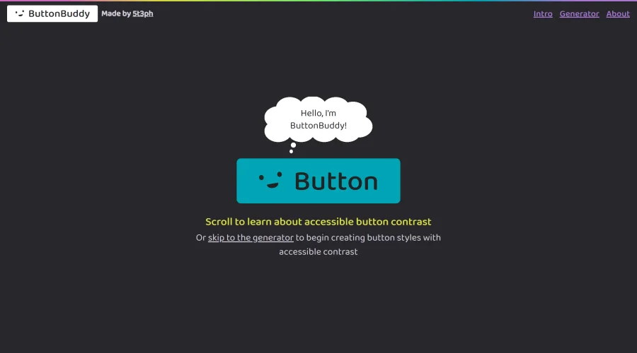

Button Buddy
Solutions for ensuring accessible contrast in button designs.
Explore Other Categories
Discover more design resources
New to Design?
Explore our comprehensive design glossary to master essential terminology from A/B Testing to Wireframes.
Browse GlossaryLooking for something specific?
Search through our entire collection of design tools and resources