© 2026 usetools. All rights reserved.
Creating layouts that fluidly adapt to different screen sizes (mobile, tablet, desktop).
Responsive design is a web development approach that ensures websites adapt seamlessly to various screen sizes and devices, providing an optimal user experience across mobile, tablet, and desktop platforms. This technique uses flexible grids, layouts, and CSS media queries to dynamically adjust the presentation of content based on the device's screen size and orientation.
As technology evolves, responsive design will continue to play a crucial role in ensuring that websites remain accessible and user-friendly across a wide range of devices and screen sizes. With the rise of new devices and screen types, such as foldable screens and smartwatches, the importance of responsive design will only grow.
Discover tools that help you apply responsive design in your work.

The design glossary is just the beginning. Explore more terms, discover tools, and level up your design skills.
Designing products and interfaces usable by people with varying abilities (e.g., vision, motor, cognitive).
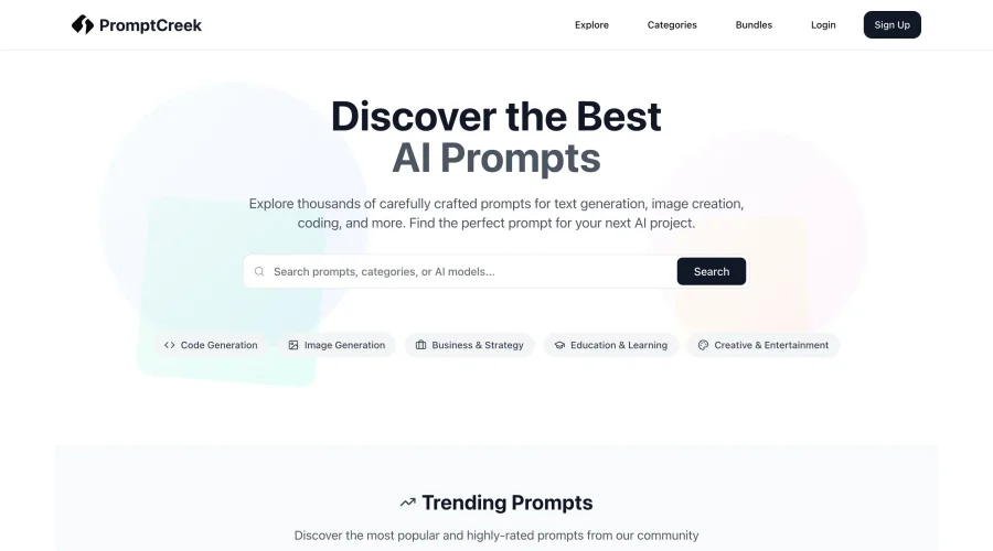
Prompt Creek is a free community-driven repository featuring thousands of AI prompts. Discover, bookmark, and share quality prompts for ChatGPT, Claude, and other AI tools.