© 2026 usetools. All rights reserved.
A standardized color matching system used for consistent color reproduction in print.
Pantone, or the Pantone Matching System (PMS), is a globally recognized standardized color matching system designed to ensure consistent color reproduction across various mediums, particularly in print. It provides a precise and reliable method for manufacturers and designers to match colors, ensuring that the final product looks exactly as intended, regardless of the location or materials used. This system is crucial in industries like graphic design, fashion, and packaging, where maintaining brand identity through consistent colors is essential.
Pantone is primarily used in the printing industry to guarantee that colors are accurately represented on different materials and under various lighting conditions. Beyond print, it is also applied in the production of plastics, textiles, and paints, facilitating a universal language of color that transcends geographical and technological barriers.
While CMYK is widely used for digital printing, Pantone is preferred when precise color control is necessary. CMYK colors can vary significantly depending on the printer and paper used, whereas Pantone colors are mixed from specific base pigments to achieve a consistent result. This makes Pantone particularly valuable for branding and packaging where consistent color is essential.
To work with Pantone colors, designers often use tools like Adobe Illustrator or specialized color matching software. These tools help convert digital colors (such as RGB or Hex) into the nearest Pantone equivalent, ensuring that the final printed product matches the digital design.
Pantone's standardized color matching system is indispensable for achieving consistent and accurate color reproduction in various industries. Its ability to transcend technological and geographical barriers has made it a global standard for color communication, ensuring that brands can maintain their visual identity across different mediums and locations.
Discover tools that help you apply pantone (pms) in your work.

The design glossary is just the beginning. Explore more terms, discover tools, and level up your design skills.
Designing products and interfaces usable by people with varying abilities (e.g., vision, motor, cognitive).
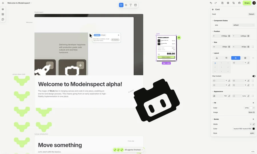
Mode turns your product’s codebase into editable canvas frames. Refine real UI with visual controls, experiment with AI then share or hand off for review.